IELTS Academic Writing Task 1
IELTS Academic Writing Task 1 Samples
Prepare for the IELTS Academic Test by using this collection of IELTS Academic Writing Task 1 practice samples. This collection is a great way to gain insight and practice for the exam.
This bar chart depicts the the nations that heve been willingness eat insects and the recent cost in market shops. It is clear frome the graph that the substantial figuer for consumption three categories :Weaverant , Bamboo Catepillar and Palm Weevil. According to waht is shown the the
The chart illustrates the average hours that married women and married men spend on household work per week. Overall, as can be seen from the diagram, married men tend to do less work at home than married women whether they have kids or not.

![The diagram below shows the average hours of unpaid work per week done by people in different categories[ unpaid work refers to such activities as childcare in the home,housework and gardening] describe the information presented below,comparing results for men and women in the categories shown.](png/bcd2b379991c714eb05a75bcadeb88b7e803.png?url=https%3A%2F%2Fimages.writing9.com%2Fbcd2b379991c714eb05a75bcadeb88b7.png&w=640&q=75)
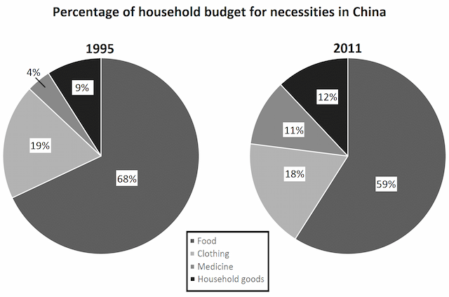
The pie charts compare the proportion of the domestic budget for the important product in China in the years 1995 and 2011.


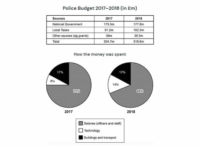
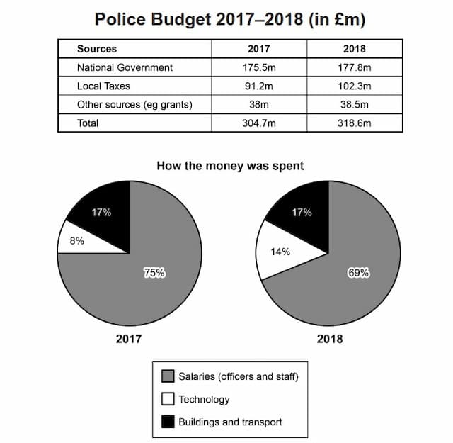
The given table and chart illustrated the police budget that the money spent in what categories and the sources came from 2017 to 2018 in Britain.

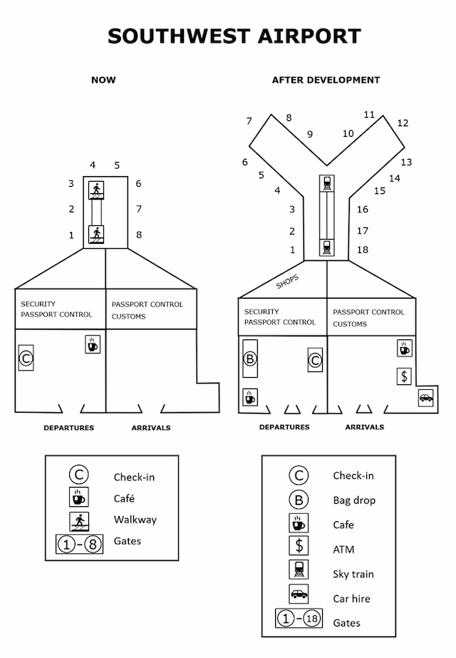
The given map demonstrates plans for future developments in the southwest airport in the year ahead.

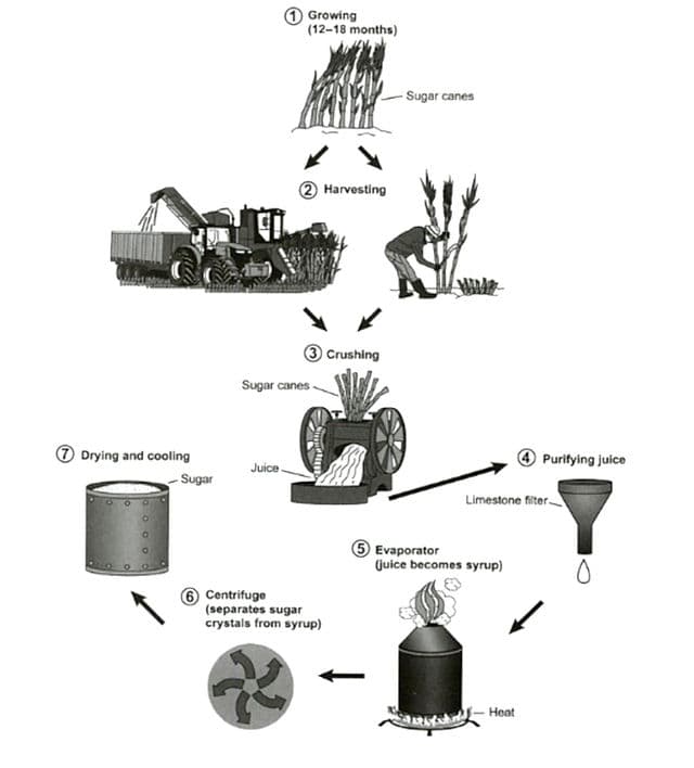
The diagram illustrates how sugar is produced from sugar canes. Overall, there are 7 stages, begging with growing sugar canes and ending with drying and cooling sugar.

The pie chart shows money expenditure on basic necessities such as Food, clothing, medicine and household goods in Chinese country during the 2 years (1995 and 2011)

The information about household percentage of spending on essential goods for the years 1995 and 2011 in China, is given on the pie charts bellow.

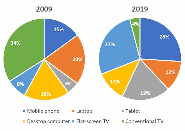
The two pie charts show the gadgets people in the 18 to 25 age categories utilized to watch TV channels between 2009 and 2019 in Canada. Overall, it is clear that conventional TV channels had a huge dropped over time.

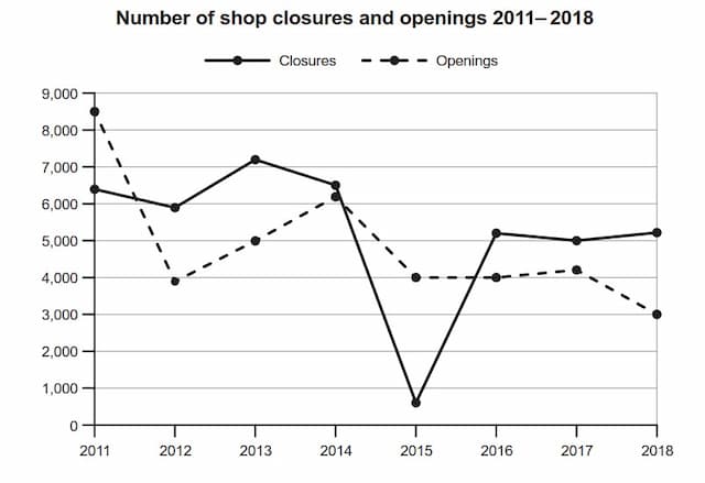
The graph illustrates the country's shops which are some closed and are some opened from 2011 to 2018.


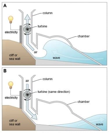
The following diagrams illustrate a structure that is used to generate electricity from wave power.

The two pie charts show the gadgets people in the 18 to 25 age categories utilized to watch TV channels between 2009 and 2019 in Canada. Overall, it is clear that conventional TV channels had a huge dropped over time.

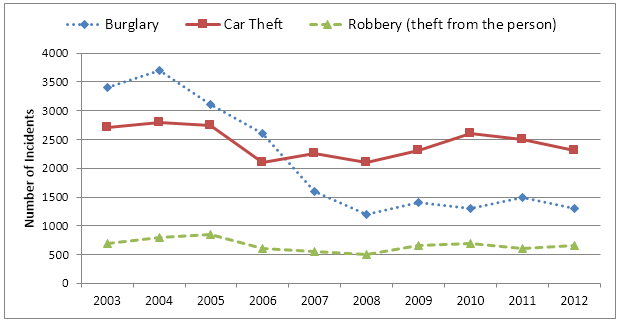
The chart displays statistics regarding the different crimes in Newport City between the years 2003 to 2012. The crimes shown are burglary, car theft and robbery.


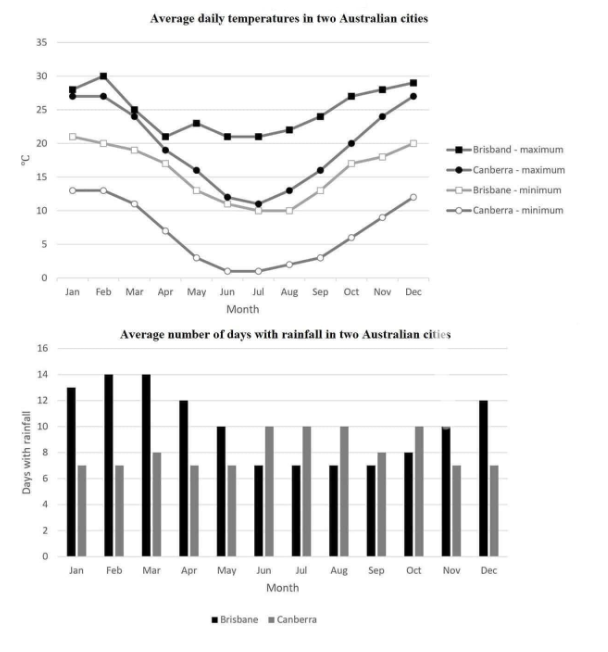
The line graph shows the daily amplitude temperature in two Australian cities, Brisbane and Canberra. Meanwhile, in the other graph, we may appreciate the number of rainy days in each month in both cities as well.

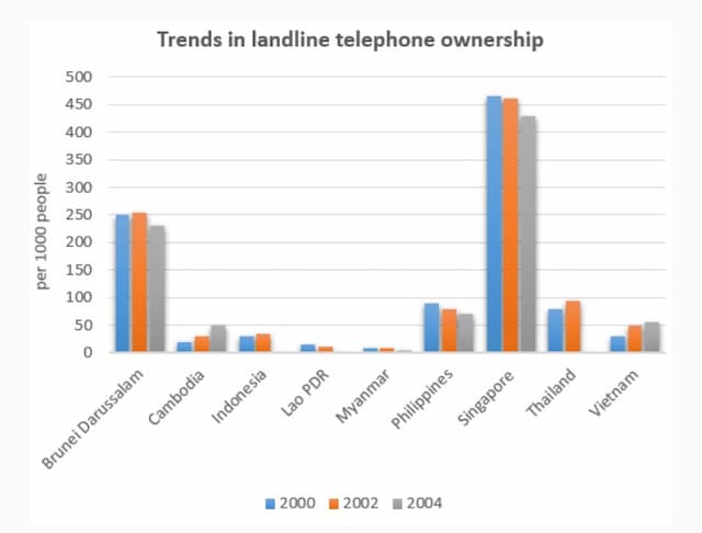
The chart illustrates the number of landline telephones per 1000 people in several countries over a five-year period.

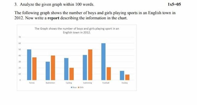
This report derives from a bar chart which illustrates the total number of how many boys and girls who perform in six different categories in sport in 2012.

The police budget and expenses of an area of Britain is depicted on the table and charts accordingly for 2017 and 2018.


The given chart depicts the amount of money destined to the police budget in a particular area of Britain between 2017 to 2018. The information is presented using a chart and a table, which shows how the money was provided and how it was used respectively. Overall, it can be seen that in both years, the National Government was the highest source of money, while grants were the lowest, We can also see that, the highest amount of money was spent to pay officers and staff salaries in both years.

8
band
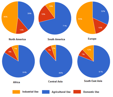
These six pie charts depict the proportion of aqua used for industrial, agricultural and domestic reasons on five continents, whereby Asia is further segregated into central and southern regions.


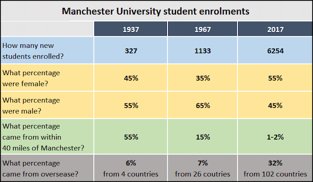
The table compares and contrasts students admission rates of Manchester University , based on five different categories , which were measured in percentage over an 80-year time period from 1937 to 2017.

The pie chart illustrates data about the proportion of Chinese people's expenditure on four fundamental items, including food, clothing, medicine and household goods, this was conducted in two different years 1995 and 2011.

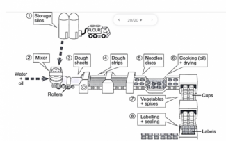
This illustration demonstrates the procedure of making instant noodles for destribution.


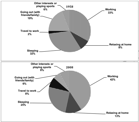
The pie charts provide information about the time spent on various activities by working professionals in a country during the years 1958 and 2008.

On the line graph bellow you can see different types of crime that ocurred in the city of Newport since 2003 to 2012.
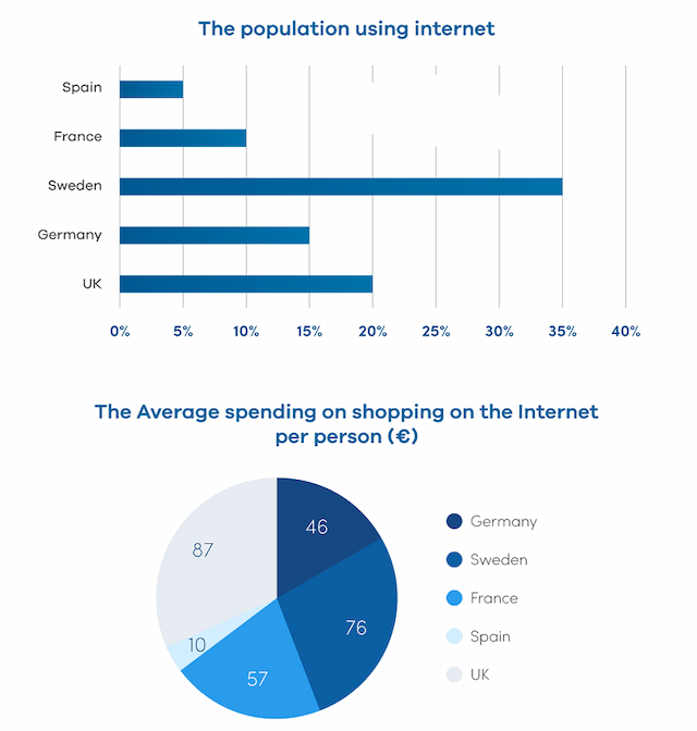
the bar graph illustrates the proportion of internet users in 5 nations in Europe in the year 2000, whereas the pie chart compares the average spending on online shopping in the aforementioned countries.

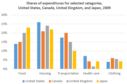
The bar chart illustrates the proportions of expenditures shares for five different categories in USA, Canada, UK and Japan in a time slot that is 2009.

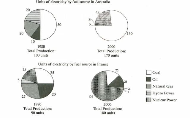
The pie graphs depict information about energy produced by fossil fuels in France and Australia from 1980 to 2000.

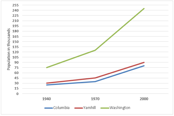
The graph shows the increase in the population of three counties, Columbia, Yamhill and Washington in the U.S. state of Oregon, between 1940 and 2000. In 1940, Columbia had the lowest population of the three counties, at around 25,000. This is compared with about 30,000 in Yamhill and approximately 75,000 in Washington.

The provided table illustrates the police budget in an area of Britain from 2017 and 2018. Also, the given chart below presents the source of money and how the budget was spent respectively.
7
band
The given chart depicts the proportion of water used for various intents such as Industrial, Agriculture, and domestic use in North America, South America, Europe, Africa, Central Asia, and South East Asia.
The given pie charts give information on the proportion of household budget spent on 4 kinds of products in China from 1995 and 2011.

The bar chart illustrates four favourite hobbies of teens in Canada, namely sports, computer games, music and shopping. On the whole, while most male teenagers find shopping and sports the most exciting , these activities are the least interesting ones for female adolescents. However, almost the same proportion of both genders enjoy playing computer games and music.


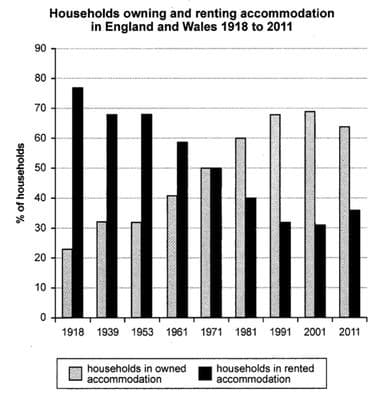
The charts give information on the figure for families possessing and borrowing accommodation in England and Wales from 1918 to 2011.

Given is a diagram illustrating the process by which instant noodles are produced.
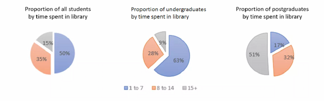
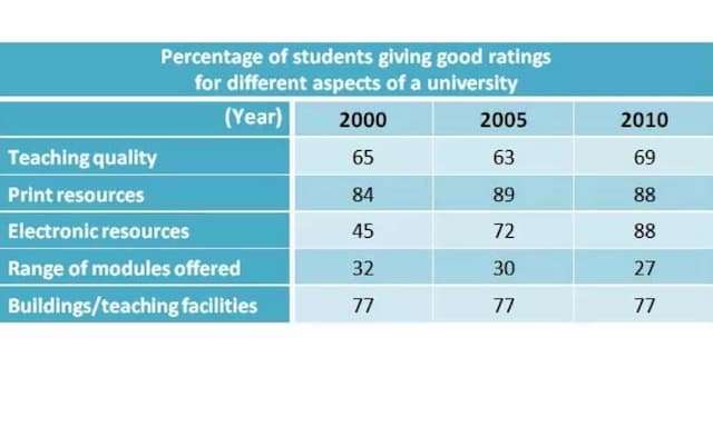
The pie charts provide information on the amount of time spent by undergraduates, postgraduates, and the total student population in a British university library.

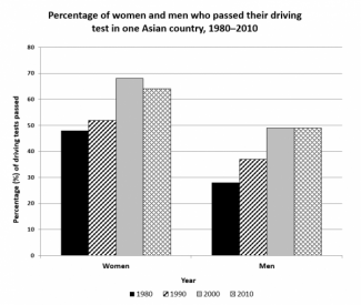
The graph illustrates the proportion of two genders in one Asian country who succeeded in acquiring their driving permit from 1980 to 2010.

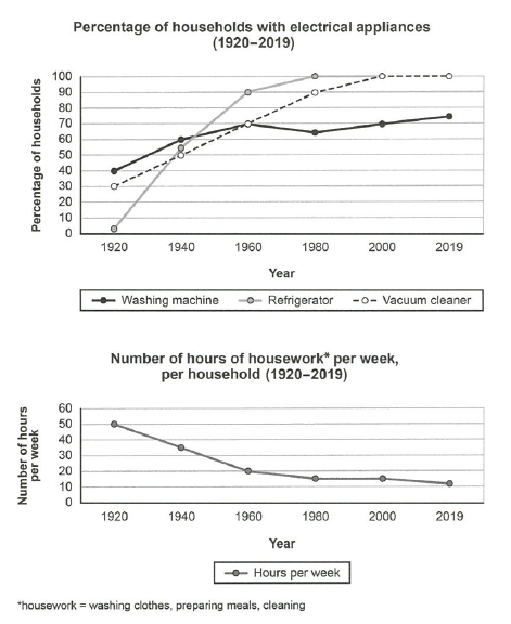
The first line chart illustrates the changes of the percentage of households using electrical appliances from 1920 to 2019. The second line chart shows the changes of the number of hours doing housework from 1920 to 2019.

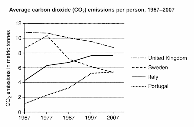
The line chart depicts information about the average of carbon dioxide emitted by each person in the Sweden, Itlay, Portugal and United Kingdom.


The table illustrates the proportion of the population more than the age of sixty-five for three years i.e., 1988, 2000 and 2030 in three nations namely Canada, Germany and UK.


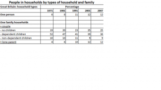
The table gives information about the changing composition of house members in great Britain at 10-year intervals from 1971 to 2001 and again in 2007.

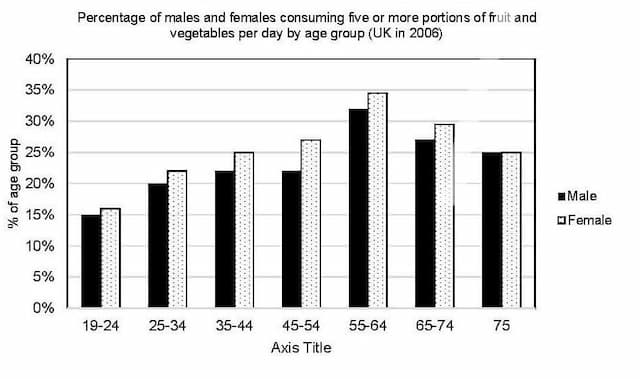
It is suggested by the World health organization that people ought to eat five or more portions of fruit and vegetables per day. The diagram illustrates the proportion of males and females in the UK by age group in 2006.

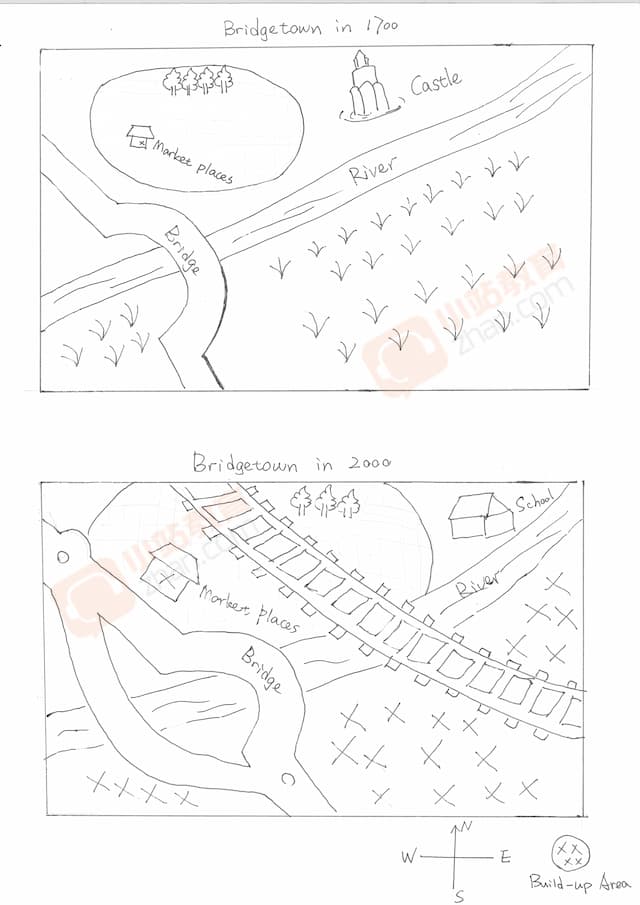
The diagrams give information on the renovation of a town name, Bridgetown in the year 1700 and 2000. A period of 300 years.

The twin pie charts illustrate the expense of household necessities in China in the year 1995 along with 2011. This is based on four parameters namely food, clothing, medicine and household goods.
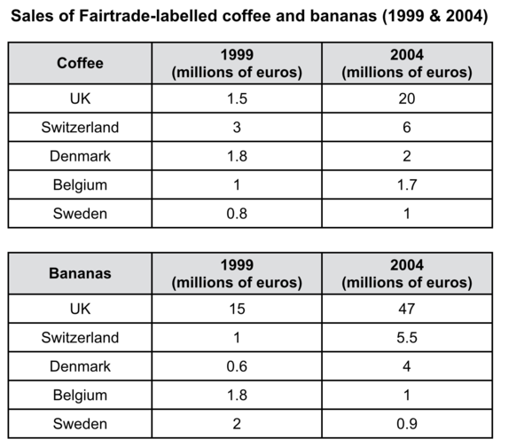
The given tables show how much money taken from sales of Fairtrade-labelled coffee and bananas in UK, Switzerland, Denmark, Belgium and Sweden. The units are measured in millions of euros for 5-year period from 1999.

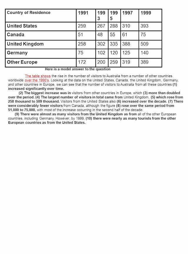
The table illustrates the number of visitors from New Zealand, Japan, Canada, China, Germany, and France to Australia in different years between 2006 and 2010.

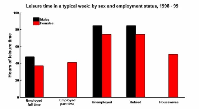
The bar chart illustrates the amount of free time per week both for men and women in five

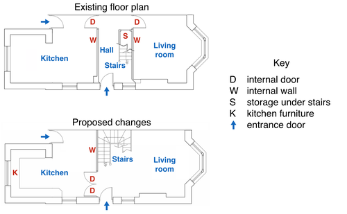
The map illustrates the existing ground floor plan of a department and a future project of detailings.

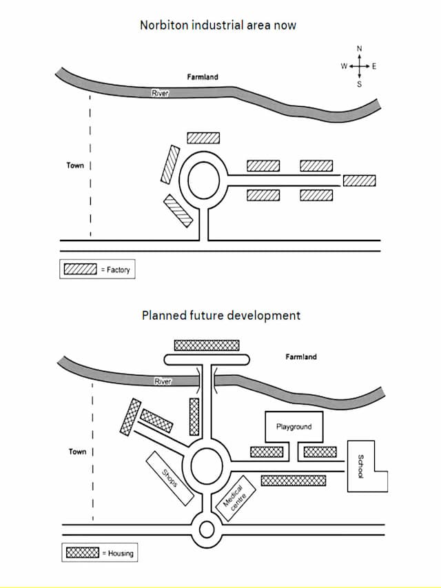
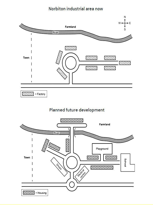
The maps illustrate industrial development in Narbition, and also show the plans for the near future. Based on those planned are include various areas such as factories, and housing.

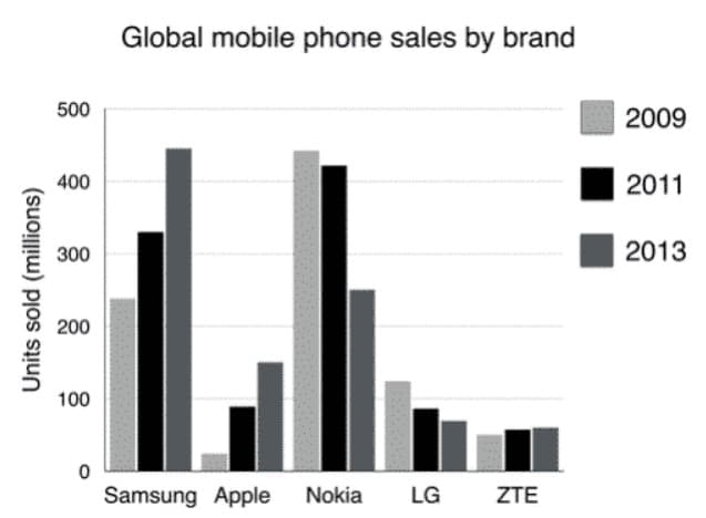
This bar chart depicts universal sales of the top brands of cell phones from 2009 to 2013. It's clear from the graph that the Samsung and Nokia phones had the most significant merchants in this period.

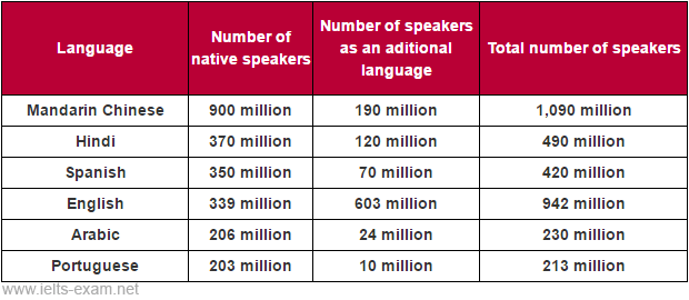
the table illustrates, the number of speakers of six Language, Mandarin Chinese, Hindi, Spanish, English, Arabic, and Portugues, therefore, divided Into three types, First one is the Number of native speakers and the second one is the Number of speakers as an additional language

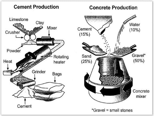
The given diagrams depict the process and tools used in cement production and how cement is used to make concrete for construction purposes.


The line graph illustrates the average amount of carbon dioxide (CO2) discharged per person in the UK, Sweden, Italy, and Portugal from 1967 to 2007.
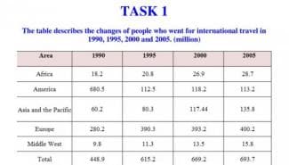
The graph indicates the population of various nations who visit foreign countries between 1990 and 2005.

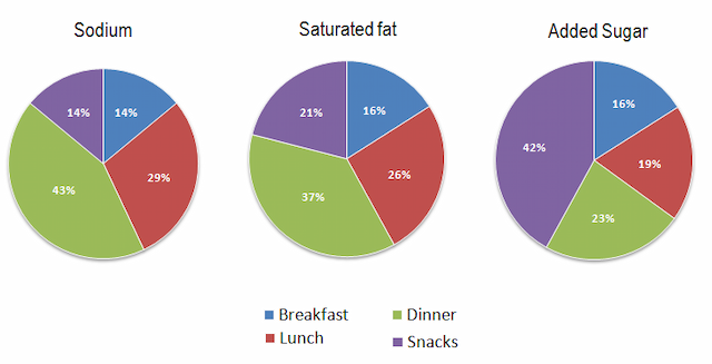
The pie charts give the information about the percentage of people in America, consuming Sodium, Saturated Fat, and Added sugar in their daily meals.


The diagrams illustrate the steps of how cement is made along with things which have to be obtained to put the concrete-making process to an end. Overall, making cement seems to be more complicated with its instruction than trying to get concrete with only a few crucial products.
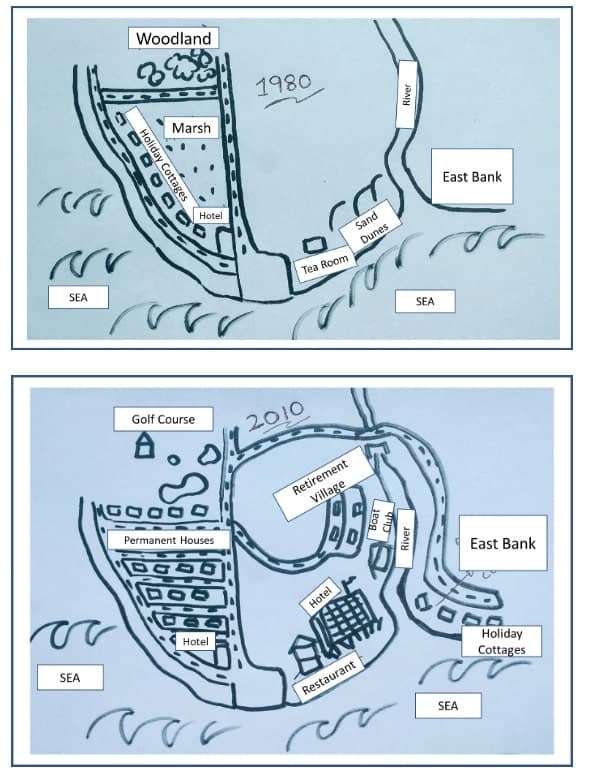
The diagrams demonstrate how the coastal village named Seaville changed over a 30-year period, starting from 1980.

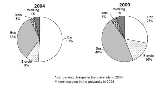
The charts illustrate crucial vehicles which students were using to get to their college between 2004 and 2009. Overall, it shows five different ways of moving around, where the usage of cars and buses seemed to be the most popular but the trains were used the least.

On the line graph bellow you can see 3 different types of crime that ocurred in the cityof Newport since 2003 to 2012.

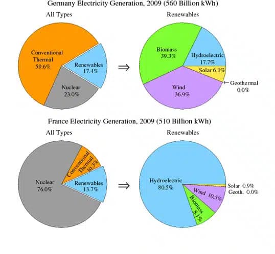
The pie chart provides data on how Germany and France produce electricity from all sources and renewables in the year 2009.

The following charts illustrate the percentage of water used for 3 different purposes in six different areas of the world.

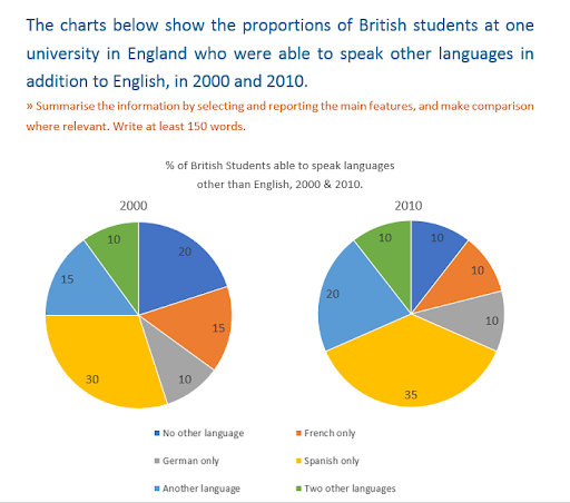
in these pie charts, we intend to compare the ability of students who were able to talk in other languages except English in 2000 and 2010 at one of the universities in the UK.

These diagrams explain the way in which cement is made from limestone and clay and later concrete is produced from cement and other materials for building industry. Overall, cement production inolves at least 5 different processes, beginning with the crushing initial resources and culminating in the packing into the bags.

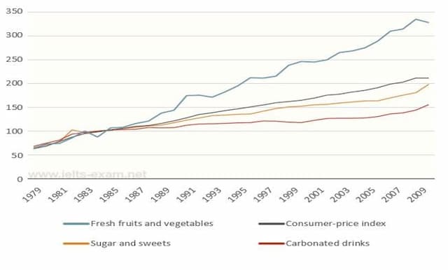
The chart illustrates how prices for fresh fruits and vegetables, sugar and sweets, and carbonated drinks altered comparatively from 1978 to 2009.

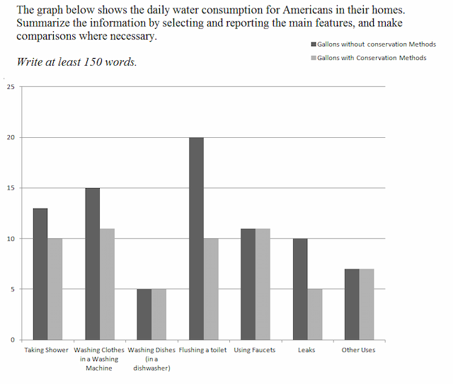
The graph provides information about the amount of water consumed in American houses every day with and without preservation strategies.

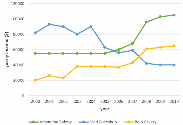
The line graph illustrates the every year income of three bakeries in Calgary between 2000 and 2010. Units are measured in dollars.

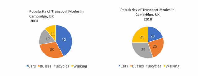
The pie charts below illustrate the number of transport modes which are divided into 4 categories; cars, busses, bicycles, and walking. In 2008 and 2018 it is located in the capital of Cambridge.

A glance at a bar chart provided reveals the figures for accommodations owned and rented by residents in England and Wales, measured in per cent, between 1918 and 2011.
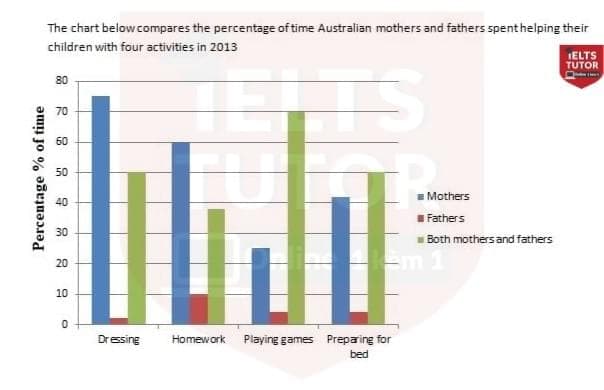
The bar chart demonstrated the proportion of time that Australian parents allocate for supporting their child in four different activities in 2013.

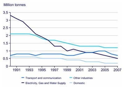
The given line graph below illustrates UK acid rain emissions, measured in millions of tonnes, from four different sectors from 1990 to 2007.

The line chart below presents the number of opened and closed shops from 2011 to 2018. Overall, the shops started to open over seven years were fluctuative as well as the closed ones.

The given bar graph illustrates the proportions of adults who got qualifications from a set of education providers in three years.

The table provides information about the annual production of milk in four different countries over a three-year period contemplating 1990, 2000, and 2010.

The given line graph illustrates the changing rates that took place in three different areas of crime in Newport city centre between 2003 and 2012.

The two maps illustrate the changes experienced by the infrastructure of the town of Lakeside from the year 2000 until 2009.

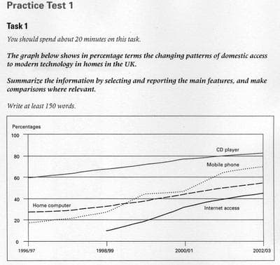
The line graph gives information in proportions about the changing pattern of domestic access to modern technology in homes in the UK.There are 4 indicators CD player,Mobile phone,Home computer and Interner access, broadly speaking it can be clearly seen that all of the lines had a growth.

The following chart illustrates the changes that took place in three different areas of crime in Newport city centre from 2003 -2012.

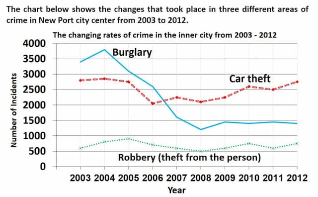
This chart represents information about crimes that occurred in three different areas of illegal activities in Newport City between 2003 and 2008.

The line chart compares the numbers of open shops and closed stores in one specific country over a period of 8 years, from 2011 to 2018.

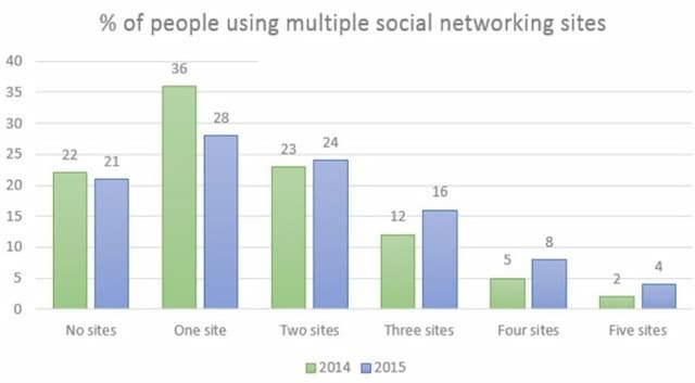
The bar chart demonstrated the percentage of Canadian society that used social channels in 2014 and 2015. As can be seen, using one site was the most popular particularly in 2014 although visiting five sites was the least common.

The Line chart compares the number of shops shut down and newly opened in one country between 2011 and 2018.
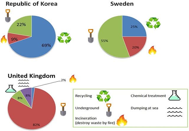
The three charts illustrate the methods of solving dangerous waste products in terms of three countries namely the Republic of Korea, Sweden, and the United Kingdom.

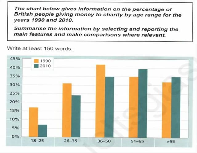
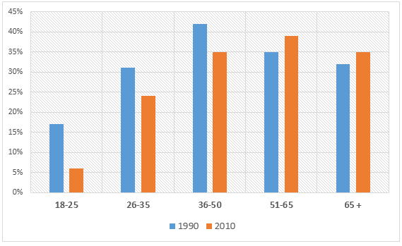
The bar chart demonstrates the proportion of citizens of different youth groups varying from 18 to over 65 in Britain who donated funds to charity between 1990 to 2010

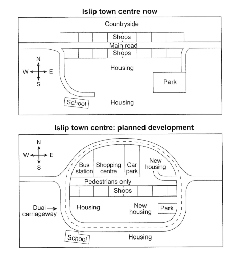
The maps present the town that is planned to be and reconstrued.

The bar chart demonstrated a percentage of Canadian society that used social channels in 2014 and 2015. Overall, using one site was the most popular particularly in 2014 although visiting five sites was the least common.

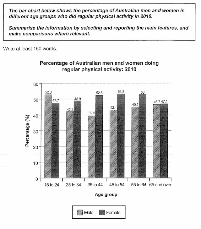
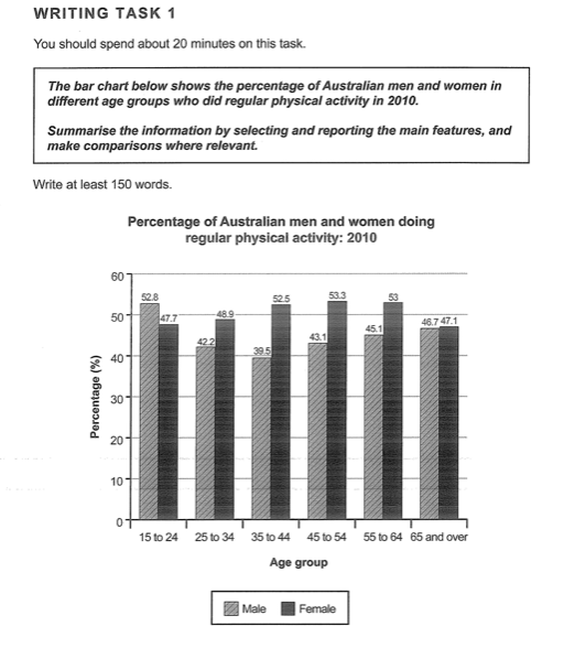
The given chart depicts Australian people of different ages and gender that work out regular exercise in 2010.

The maps illustrate the significant changes in the seaside village in Seaville over the 30-year period.

The table compares different products, which were exported from Hong Kong over a 1-year period, from 2009 to 2010. The units are measured in Hong Kong dollars.

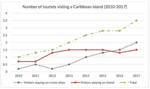
This line graph illistrates the number of people, who visit one of a caribbean island during a paricular period of time. There is a considerable increase of travellers visiting this place over these 7 years period.

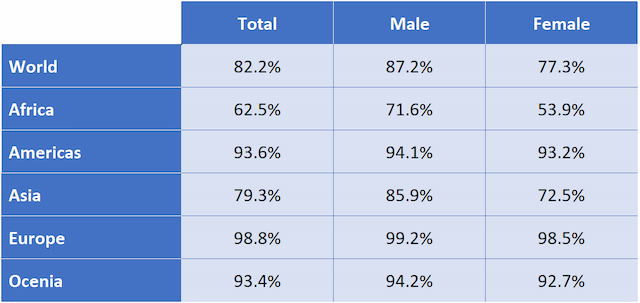
The table illustrates the information regarding the literacy percentage in different regions between males and females from 2000 to 2004.The data is calibrated in percentage.

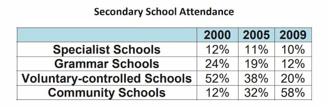
The table illustrates the percentage of students' attendance in four types of secondary schools between 2000 and 2009.

The tabular representation illustrates the information regarding the number of polls by learners in three different 3 years.The data is calibrated in percentage.

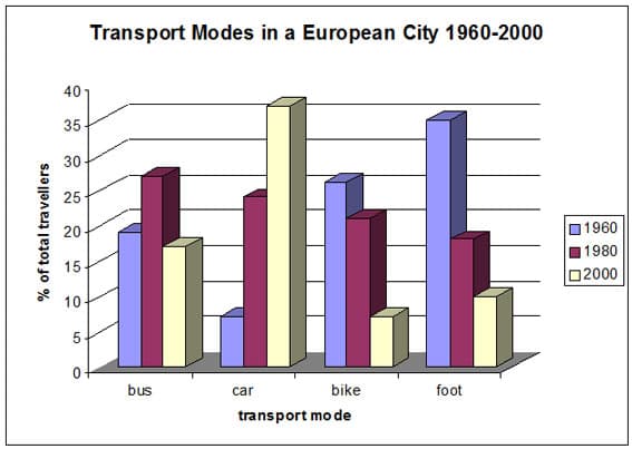
The bar graph depicts information about the distnict types of transportation was using to reach to their work in particular European city between 1960,1980 and 2000.

The given line graph illustrates the statistic of markets which were closed and opened during the eight years period in one country.

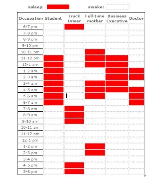
The table below illustrates the data about the sleep time of various jobs based on Canadian research,

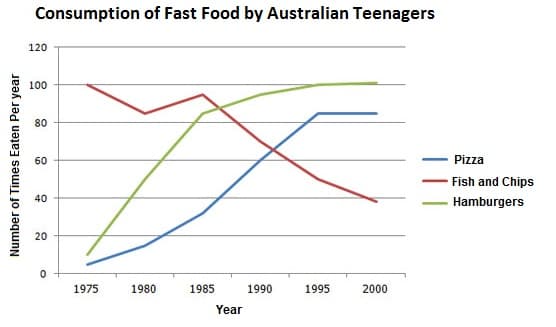
The line graph illustrates the amount of fast food consumed by teenagers in Australia between 1975 and 2000, a period of 25 years.

The map charts depict information about the commercial area in Norbinton and it will be changed in the upcoming time.

The column chart describes the sum of males and females who attend the evening program at a teaching centre in the year 2009. The pie chart illustrates dates about the ages of these students.

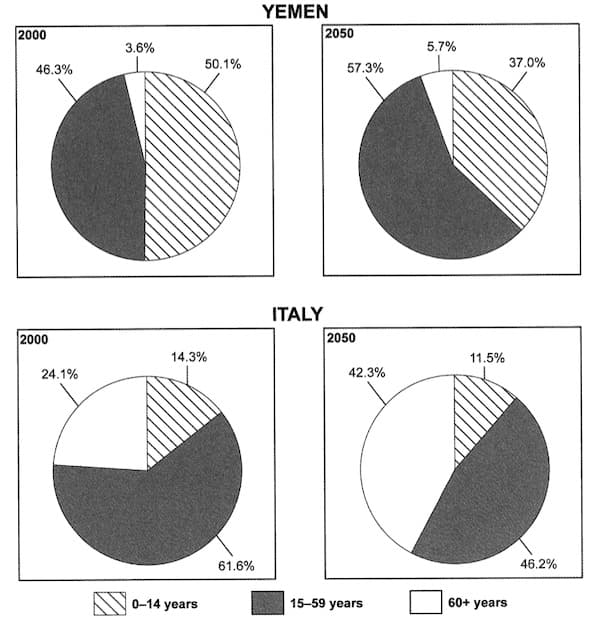
The pie charts illustrate data about the proportion of Yemeni and Italian citizens according to 3 different age groups in 2000, with the future forecast for 2050.

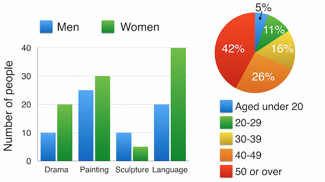
The two pie charts illustrate the percentages of British university students who can use other languages besides English in two different years.

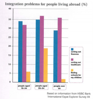
The chart illustrates three main challenges people aged 18 to 55 face when they are living abroad.