The charts show the main methods of transport of people travelling to one university in 2004 and 2009. Summarise the information be selecting and reporting the main features, and make comparisons where relevant.

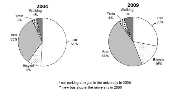
The charts illustrate crucial vehicles which students were using to get to their college between 2004 and 2009.
Overall
, it shows five different ways of moving around, where the usage of cars and buses seemed to be the most popular but the trains were used the least.
In 2004 a car was the best method of transport to use, which estimated
Correct article usage
an estimated
of
51%. Change preposition
at
Where
in 2009 it dropped to 28%. When, in 2004, the usage of buses consist of 33% and 5 years later it increased to 46%.
Correct word choice
Whereas
On the other hand
trains in 2004 were only 3% of all the transport which have been used. Which stayed almost the same in 2009, rising up to 4%. The
similar thing happened with walking, which was 4% and a few years later happened to be 6%. Correct article usage
A
Finally
, in 2004 4% of society used to walk, which in 2009 increased to 6%, which was not a huge changeSubmitted by alekssandrahoffa on
Unauthorized use and/or duplication of this material without express and written permission from this site’s author and/or owner is strictly prohibited. Excerpts and links may be used, provided that full and clear credit is given to Writing9 with appropriate and specific direction to the original content.
Conclusion: The conclusion is too long.
Vocabulary: The word "increased" was used 2 times.
▼