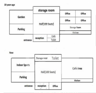
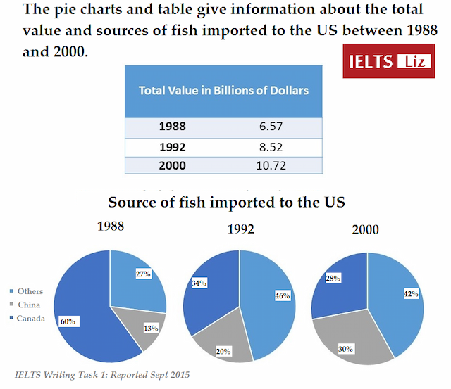
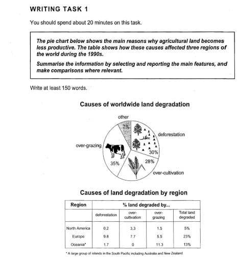
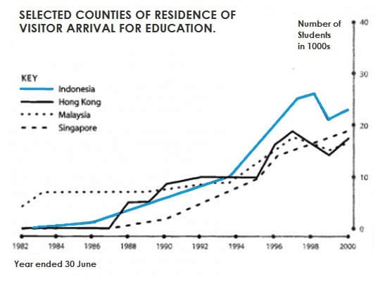
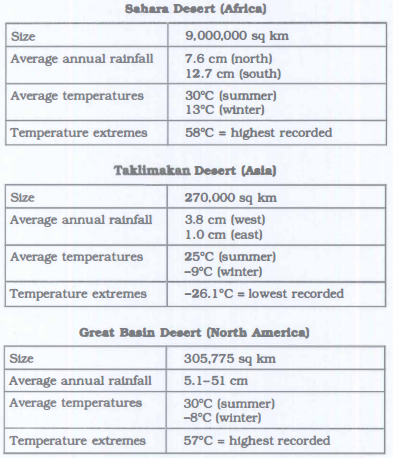
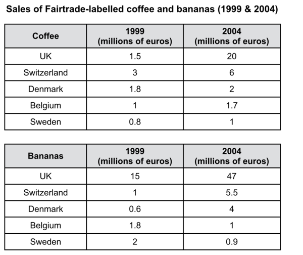
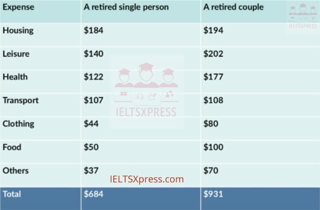
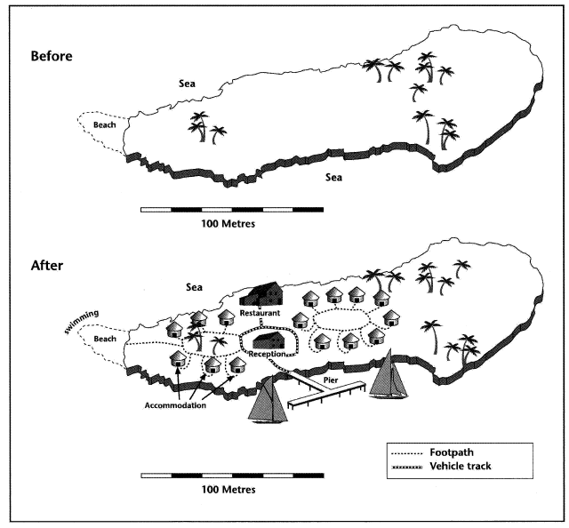
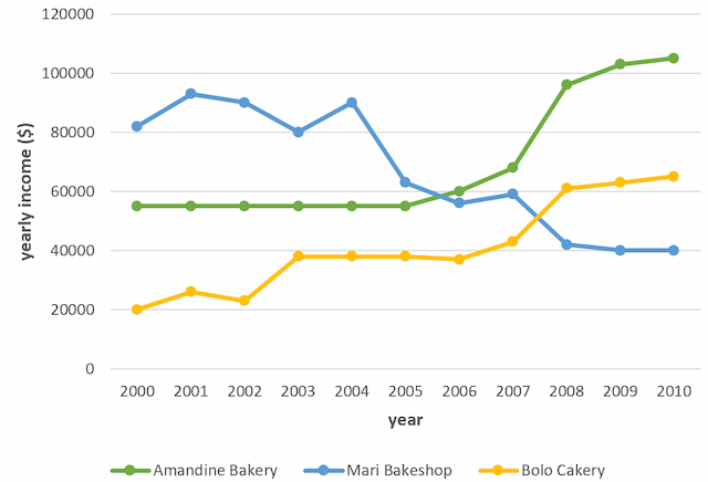
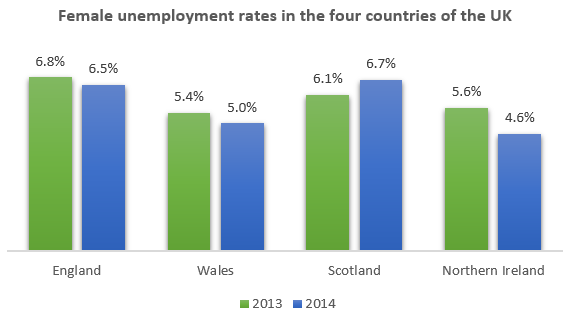
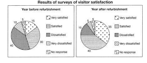
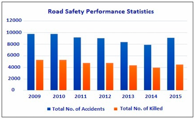
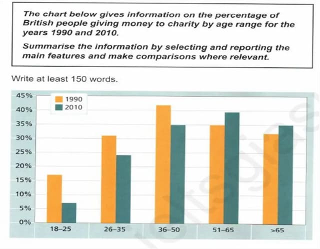
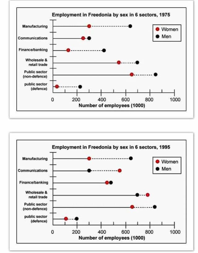
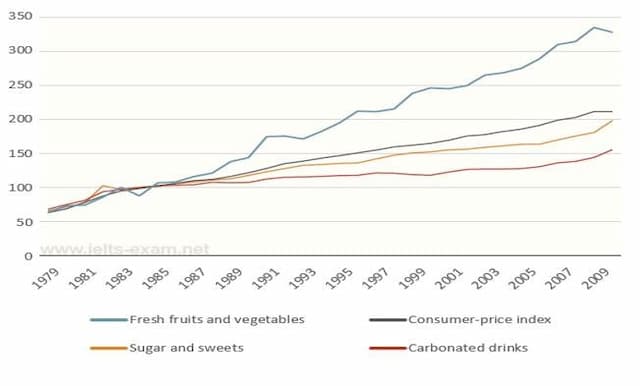
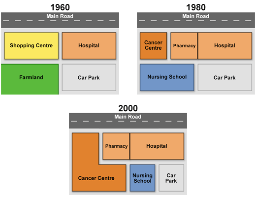
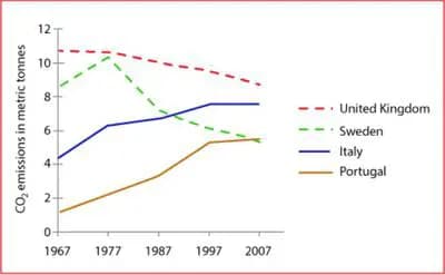
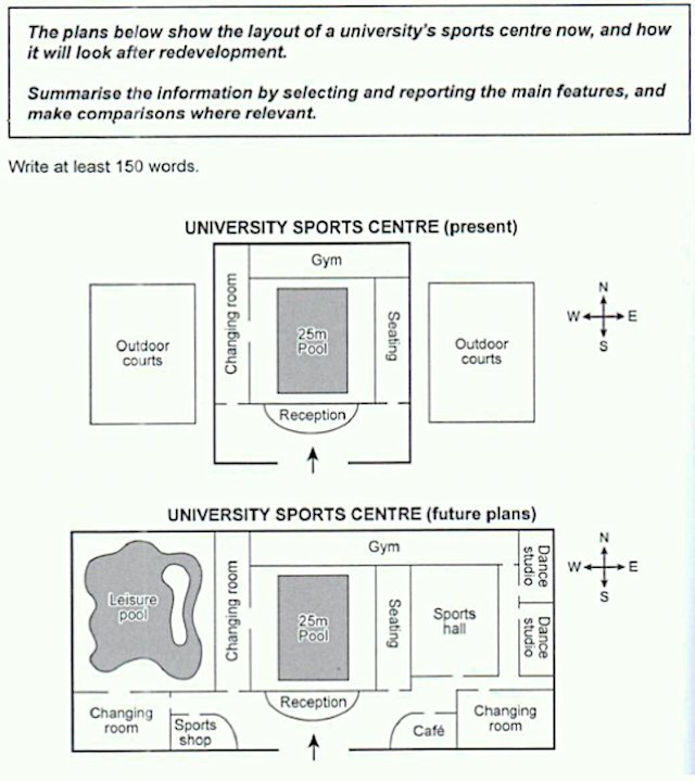
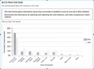
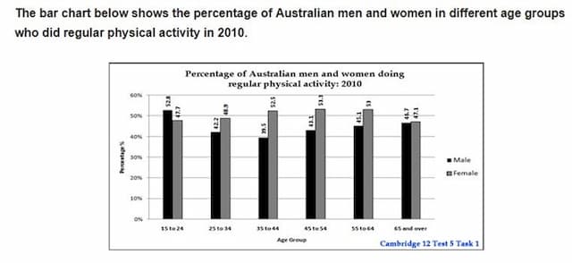
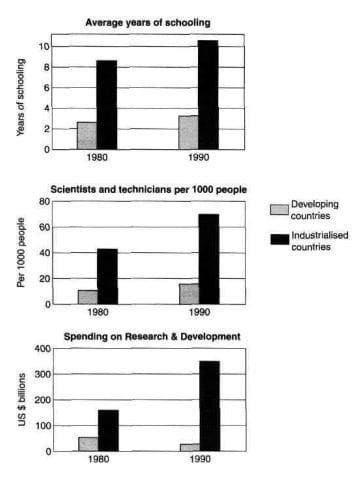
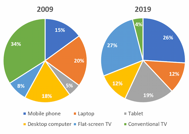
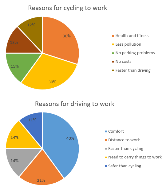
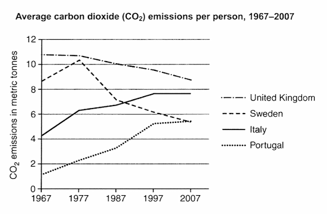
IELTS Academic Writing Task 1 Topics April & May 2023

Get a band score and detailed report instantly. Check your IELTS essays right now!

The collection of the recent IELTS Academic Writing Topics is a compilation of topics which have been recently used in IELTS Academic Writing Task 1. These topics cover a wide range of topics, from everyday topics such as shopping and leisure activities to more complex topics such as healthcare, economics, and technology. The topics are chosen from past IELTS exams and reflect the kinds of topics students may be asked to write about in their upcoming IELTS exam. The Collection of the recent IELTS Academic Writing Topics provides students with useful practice material to help them prepare for the IELTS exam.

Choose one of the topics and practice your writing skills daily. If you are having difficulty coming up with your own topic ideas, simply click the "Show Answers" button and you will be presented with a range of possible topics.
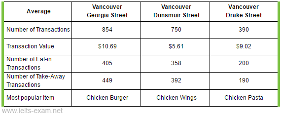
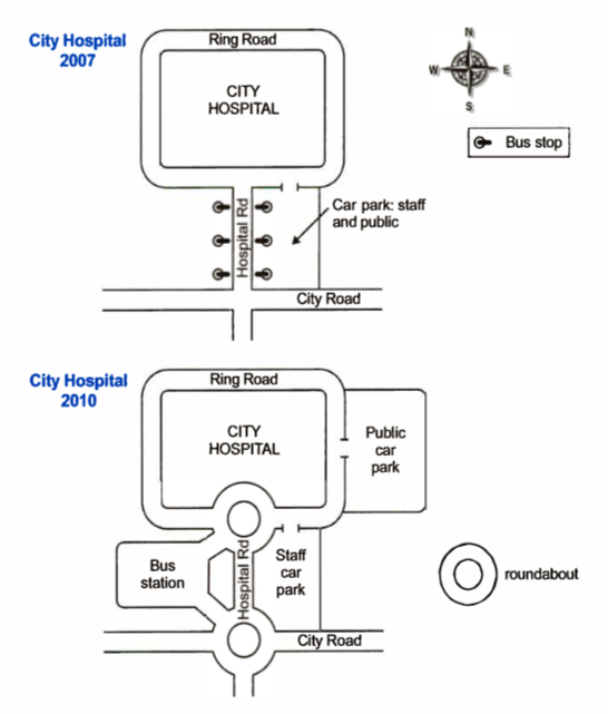
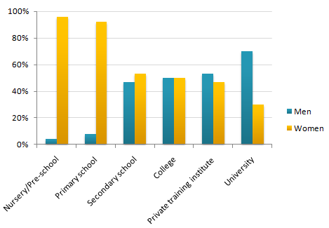
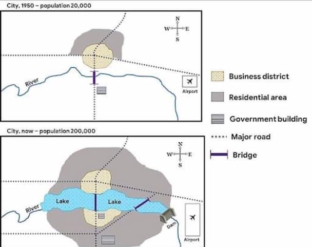
The chart below gives information about the household percentage of spending on essential goods in China for the years 1995 and 2011

The chart below shows the percentage of water used for different purposes in six areas of the world.
The chart below shows the percentage of water used for different purposes in six  areas of the world.

The charts below show the average percentages in typical meals of three types of nutrients, all of which may be unhealthy if eaten too much. Summarise the information by selecting and reporting the main features, and make comparisons where relevant. IELTS Cambridge 14 Pie Charts
The charts below show the average percentages in typical meals of three types of nutrients, all of which may be unhealthy if eaten too much.

Summarise the information by selecting and reporting the main features,

and make comparisons where relevant.

IELTS Cambridge 14 Pie Charts

The diagram shows a process of making a storage area from a material called concrete canvas

The table below gives information about student enrolments at Manchester University in 1937, 1967 and 2017.

The charts show survey results concerning why MBA graduates did their degree, and employer's reasons for hiring them. Summaries the information by selecting and reporting the main features, and make comparisons where relevant.
The charts show survey results concerning why MBA graduates did their degree, and employer's reasons for hiring them.

Summaries the information by selecting and reporting the main features, and make comparisons where relevant.

the pie charts below show units of electricity production by fuel source in Australia and France in 1980 and 2000.

The chart below shows participation in certain leisure activities by children in Australia. Write a report for university lecturer describing the information shown below.
The chart below shows participation in certain leisure activities by children in Australia.

Write a report for university lecturer describing the information shown below.

The diagram below shows the average hours of unpaid work per week done by people in different categories[ unpaid work refers to such activities as childcare in the home,housework and gardening] describe the information presented below,comparing results for men and women in the categories shown.

The bar chart shows the scores of teams A, B and C over four different seasons. Summarise the information by selecting and reporting the main features and make comparisons where relevant.
The bar chart shows the scores of teams A, B and C over four different seasons.

Summarise the information by selecting and reporting the main features and make comparisons where relevant.

The charts show projections for global production by sector in 2040 and 2060. Summarise the information by selecting and reporting the main features, and make comparisons where relevant.
The charts show projections for global production by sector in 2040 and 2060.

Summarise the information by selecting and reporting the main features, and make comparisons where relevant.

The pie charts below compare water usage in San Diego, California, and the rest of the world.

The pie charts below show units of electricity production by fuel source in Australia and France in 1980 and 2000. Summaries the information by selecting and reporting the main features, and make comparisons where relevant.

The graph below gives information from a 2008 report about consumption of energy in the USA since 1980 with projections until 2030. Summaries the information by selecting and reporting the main features, and make comparisons where relevant.
The graph below gives information from a 2008 report about consumption of energy in the USA since 1980 with projections until 2030.

Summaries the information by selecting and reporting the main features, and make comparisons where relevant.

The graph below shows how elderly people in the United States spent their free time between 1980 and 2010.

The bar chart below shows the percentage of unemployed graduates, aged 20-24, in one European country over of two-year period. Summerise the information and reporting the main features, and making comparisons where relevant.
The bar chart below shows the percentage of unemployed graduates, aged 20-24, in one European country over of two-year period.

Summerise the information and reporting the main features, and making comparisons where relevant.

The charts below show the changes in ownership of electrical appliances and amount of time spent doing housework in households in one country between 1920 and 2019. Summarise the information by selecting and reporting the main features, and make comparisons where relevant. Vrite at least 150 words.

the chart below shows the aid form six developed countries to devloping countries from 2008-2009

The chart below gives information about global population percentages and distribution of wealth by region. Summarize the information by selecting and reporting the main features, and make comparisons where relevant.
The chart below gives information about global population percentages and distribution of wealth by region. 

Summarize the information by selecting and reporting the main features, and make comparisons where relevant.

You should spend about 20 minutes on this task. The pie charts show the electricity generated in Germany and France from all sources and renewables in the year 2009. Summarize the information by selecting and reporting the main features and make comparisons where relevant. Write at least 150 words.
You should spend about 20 minutes on this task.

The pie charts show the electricity generated in Germany and France from all sources and renewables in the year 2009.

Summarize the information by selecting and reporting the main features and make comparisons where relevant.

Write at least 150 words.

The chart below shows the value of one country's export in various cayegories during 2015 and 2016. The table shows the percentage changes in each category of exports in 2016 compared with 2015.

The maps show the changes of a community center 10 years ago and until the present

The pie charts and table give information about the total value and sources of fish imported to the US between 1988 and 2000.

The pie chart below shows the main reasons why agricultural/and becomes less productive. The table shows how these causes affected three regions of the world during the 1990s. Summarise the information by selecting and reporting the main features, and make comparisons where relevant.
The pie chart below shows the main reasons why agricultural/and becomes

less productive. The table shows how these causes affected three regions of

the world during the 1990s.

Summarise the information by selecting and reporting the main features, and

make comparisons where relevant.

You should spend about 20 minutes on this task. The graph below shows four countries of residence of overseas students in Australia. Summarize the information by selecting and reporting the main features, and make comparisons where relevant. Write at least 150 words.
You should spend about 20 minutes on this task.

The graph below shows four countries of residence of overseas students in Australia.

Summarize the information by selecting and reporting the main features, and make comparisons where relevant.

Write at least 150 words.

The table shows the average time and money spent at different types of restaurants. Summarize the information by selecting and reporting in the main features and make comparisons where relevant.
The table shows the average time and money spent at different types of restaurants.

Summarize the information by selecting and reporting in the main features and make comparisons where relevant.

two pie charts below show the percentages of industry's sectors' contribution to the economy

The chart below shows the proportion of male and female students studying six art-related subjects at a UK university in 2011. Summaries the information by selecting and reporting the main features, and make comparisons where relevant.
The chart below shows the proportion of male and female students studying six art-related subjects at a UK university in 2011. 

Summaries the information by selecting and reporting the main features, and make comparisons where relevant.

the diagram shows the process of photosynthesis. summarise the information by selecting and reporting the main futures.

The graph below shows the percentage of part-time workers in each country of the United Kingdom in 1980 and 2010. Summarise the information by selecting and reporting the main features, and make comparisons where relevant.
The graph below shows the percentage of part-time workers in each country of the United Kingdom in 1980 and 2010.

Summarise the information by selecting and reporting the main features, and make comparisons where relevant.

The charts below show information about three different deserts around the world. Summarize the information by selecting and reporting the main information and making comparisons.
The charts below show information about three different deserts around the world.

Summarize the information by selecting and reporting the main information and making comparisons.

The graphs below show the numbers of male and female workers in 1975 and 1995 in several employment sectors of the Republic of Freedonia. Write a report for a university teacher describing the information shown.
The graphs below show the numbers of male and female workers in 1975 and 1995 in several employment sectors of the Republic of Freedonia.

Write a report for a university teacher describing the information shown.

The tables below give information about sales of Fairtrade*-labelled coffee and bananas in 1999 and 2004 in five European countries.

The charts below show the percentage of Australian men and women in three age groups who were employed in 1984, 2001 and 2014. Summarise the information by selecting and reporting the main features, and make comparisons where relevant.
The charts below show the percentage of Australian men and women in three age groups who were employed in 1984, 2001 and 2014.

Summarise the information by selecting and reporting the main features, and make comparisons where relevant.

The table below illustrates how much money a single person and a couple in Australia need for a comfortable lifestyle after they retire.

The two maps below show an island, befor and after the construction of some tourist facilities. Summarise the information by selecting and reporting the main features, and make comparisions where relevant.
The two maps below show an island, befor and after the construction of some tourist facilities.

Summarise the information by selecting and reporting the main features, and make comparisions where relevant.

You should spend about 20 minutes on this task. The graph below shows the number of enquiries received by the Tourist Information Office in one city over a six-month period in 2011. Summarize the information by selecting and reporting the main features and make comparisons where relevant.
You should spend about 20 minutes on this task.

The graph below shows the number of enquiries received by the Tourist Information Office in one city over a six-month period in 2011.

Summarize the information by selecting and reporting the main features and make comparisons where relevant.

given table illustrates the proportions of attendance in secondary schools in india. These values are given from 2000 to 2015 with a gap of 5 year

The graph below shows the proportion of the population aged 65 and over between 1940 and 2040 in three different countries

The two pie charts below show the percentages of industry sectors’ contribution to the economy of Turkey in 2000 and 2016. Summarize the information by selecting and reporting the main features, and make comparisons where relevant.
The two pie charts below show the percentages of industry sectors’ contribution to the economy of Turkey in 2000 and 2016.

Summarize the information by selecting and reporting the main features, and make comparisons where relevant.

The graph below shows the percentage of dependents in 2000 and predicted figures in 2050 in five countries, and also gives the world average.

The table describes the changes of people who went for international travel in 1990, 1995, 2000 and 2005. (million). Summarise the information by selecting and reporting the main features and make comparisons where relevant.
The table describes the changes of people who went for international travel in 1990, 1995, 2000 and 2005. (million).

Summarise the information by selecting and reporting the main features and make comparisons where relevant.

The pie charts below show how dangerous waste products are dealt with in three countries. Write a report for a university, lecturer describing the information shown below. Summarise the information by selecting and reporting the main features and make comparisons where relevant.
The pie charts below show how dangerous waste products are dealt with in three countries.

Write a report for a university, lecturer describing the information shown below.

Summarise the information by selecting and reporting the main features and make comparisons where relevant.

You should spend about 20 minutes on this task. The bar chart below shows estimated world illiteracy rates by region and by gender for the last year. Summarise the information by selecting and reporting the main features, and make comparisons where relevant. You should write at least 150 words.
You should spend about 20 minutes on this task.

The bar chart below shows estimated world illiteracy rates by region and by gender for the last year.

Summarise the information by selecting and reporting the main features, and make comparisons where relevant.

You should write at least 150 words.

The pie charts below show the results of a surveys into the popularity of various leisure activities among European adults in 1985 and 1995.

The given maps compare the changes that took place at a city hospital in 2 different years,2007 and 2010

describe a graph that shows average growth in domestic products in wealthy countries, globalisers and non-globalisers.

The graph below gives information about international tourist arrival in different parts of the world. Summarize the information by selecting and reporting the main features, and make comparisons where relevant.
The graph below gives information about international tourist arrival in different parts of the world.

Summarize the information by selecting and reporting the main features, and make comparisons where relevant.

The graph below shows the different home activities among young children in four different countries.

The graph shows data about the annual earnings of three bakeries in Calgary, 2000-2010. Summarise the information by selecting and reporting the main features, and make comparisons where relevant.
The graph shows data about the annual earnings of three bakeries in Calgary, 2000-2010.

Summarise the information by selecting and reporting the main features, and make comparisons where relevant.

The graph below shows female unemployment rates in each country of the United Kingdom in 2013 and 2014. Summarise the information by selecting and reporting the main features, and make comparisons where relevant.
The graph below shows female unemployment rates in each country of the United Kingdom in 2013 and 2014.

Summarise the information by selecting and reporting the main features, and make comparisons where relevant.

The table below shows the numbers of visitors to Ashdown Museum during the year before and the year after it was refurbished. The charts show the result of surveys asking visitors how satisfied they were with their visit, during the same two periods. Summarize the information by selecting and reporting the main features, and make comparison where relevant.
The table below shows the numbers of visitors to Ashdown Museum during the year before and the year after it was refurbished. The charts show the result of surveys asking visitors how satisfied they were with their visit, during the same two periods.

Summarize the information by selecting and reporting the main features, and make comparison where relevant.

The chart below show the percentage of fatal accidents by locations in a European country. The survey was conducted in 2000.

The graph below shows the total value of exports and the value of fuel, food and manufactured goods exported by one country from 2000 to 2005. Summarise the information by selecting and reporting the main features, and make comparisons where relevant.
The graph below shows the total value of exports and the value of fuel, food and manufactured goods exported by one country from 2000 to 2005.

Summarise the information by selecting and reporting the main features, and make comparisons where relevant.

The chart below shows the result of a recent survey into the causes of poor school attendance in the UK

The graph below shows the amount of tea and coffee imported by four different countries. Summarise the information by selecting and reporting the main points and make comparisons where relevant.
The graph below shows the amount of tea and coffee imported by four different

countries. Summarise the information by selecting and reporting the main points and

make comparisons where relevant.

The chart below gives information about the number of social networking sites people used in Canada in 2014 and 2015. Summarise the information by selecting and reporting the main features, and make comparisons where relevant. Write at least 150 words.

the graphs below show data of Australian trades with three other countries

The graphs below show the numbers of male and female workers in 1975 and 1995 in several employment sectors of the Republic of Freedonia.

he given graph illustrates the change in the prices of fresh fruits, vegetables, sugars, sweets, and carbonated drinks from 1978 to 2009. It is also representing consumer-price index during this period.
he given graph illustrates the change in the prices of  fresh fruits, vegetables, sugars, sweets, and carbonated drinks from 1978 to 2009. It is also representing consumer-price index during this period.

The bar chart compares the share of Britain’s population who consumed five or more portions of fruits and vegetables in their daily meals. The data is categorised according to gender and age.

The maps below show the changes that occurred to a town named Willington in 1780, 1860, and 2000. Summarize the information by selecting and reporting the main features and make comparisons where relevant.

The diagram below show the change that have taken place ar queen mary hospital since its construction in 1960.

the graph describes the changes in medical funding in four countries from 2010 to 2018.

The bar charts below show the percentages of men and women in employment in three countries in 2005 and 2015. Summarise the information by selecting and reporting the main features, and make comparisons where relevant.
The bar charts below show the percentages of men and women in employment in three countries in 2005 and 2015.

Summarise the information by selecting and reporting the main features, and make comparisons where relevant.

The graph below gives information about the number of cases of diarrhea in Mashhad between 1983 and 1992.

the threeb pie charts below show the changes in annual spending by a particular UK school in 1981,1991 and 2001

The line graphs show wheat exports in Australia, Canada and European Community Summarise the information by selecting and reporting the main features, and make comparisons where relevant.
The line graphs show wheat exports in Australia, Canada and European Community

Summarise the information by selecting and reporting the main features, and make comparisons where relevant.

The graph below shows average carbon dioxide(CO2) emission per person in the United Kingdom, Sweden , Italy and portugal between 1967 and 2007 summarise the information by selecting and reporting the main featire and make comparisions where relevant
The graph below shows  average carbon dioxide(CO2) emission per person in the United Kingdom, Sweden , Italy and portugal between 1967 and 2007

summarise the information by selecting and reporting the main featire and make comparisions where relevant

The two maps compare the same sporting center of a specific university in 2007 and present. Summarise the information by selecting and reporting the main features and make comparisons where relevant.

The chart gives information about how commuters travelled to work in one city in New Zealand.

The chart below gives information about science qualifications held by people in two countries. Summarise the information by selecting and reporting the main features, and make comparisons where relevant.

The bar chart below shows percentages of three groups of Australian children taking part in four kinds of activities in 2012. Summarise the information by selecting and reporting the main features, and make comparisons where relevant.
The bar chart below shows percentages of three groups of Australian children taking part in four kinds of activities in 2012.  

Summarise the information by selecting and reporting the main features, and make comparisons where relevant.

The table below gives information about the problems faced by children in two primary schools in 2005 and 2015.

The chart show the percentage of male and female teachers in different types of educational setting in the UK in 2010

The diagrams below show the stages and equipment used in the cement making process, and how cement is used to produce concrete for building purposes. Summarise the information by selecting and reporting the main features, and make comparisons where relevant.
The diagrams below show the stages and

equipment used in the cement making process,

and how cement is used to produce concrete for

building purposes.

Summarise the information by selecting and

reporting the main features, and make

comparisons where relevant.

The graphs below show the number of visitors to two cities in a given year. Summarize the information by selecting and reporting the main features, and make comparisons where relevant.

The line graph illustrates the population figure of different types of turtles in India between 1980 and 2012. Summarise the information

The two maps illustrated the distribution of the facilities of the May city in 1950 ( the one on the top) and in present ( the one on the bottom).
The two maps illustrated the distribution of the facilities of the May city in 1950 ( the one on the top)  and in present ( the one on the bottom).

The pie chart show the main reasons of money spent on various facilites in 2000. Summarize the information by selecting and reporting the main features and make comparisons where relevant. Write at least 150 words
The pie chart show the main reasons of money spent on various facilites in 2000.

Summarize the information by selecting and reporting the main features and make comparisons where relevant.

Write at least 150 words

The graph below shows the percentage of people going to cinemas in one European country on different days.

The line graph shows the percentage of spending in a European country from 1960 to 2000.

The graph shows the nebberredfteverseas vigtters lEuredicted different areas in a European country between 1987 and 2007. Summarize the information by selecting and reporting the main features, and make comparisons where relevant.

The map below is of town of Garldson, a new supermarket (S) is planned for the town. The map shows two possible sites for the supermarket. Summarise the information by selecting and reporting the main features, and make comparisons where relevant.
The map below is of town of Garldson, a new supermarket (S) is planned for the town. The map shows two possible sites for the supermarket.

Summarise the information by selecting and reporting the main features, and make comparisons where relevant.

The two maps show a park in 2010 and in present. Summarise the information by selecting and reporting the main features, and make comparisons where relevant.

The table below gives information about languages with the most native speakers.

The diagrams below show a structure that is used to generate electricity from wave power. Summarise the information by selecting and reporting the main features, and make comparisons where relevant.
The diagrams below show a structure that is used to generate electricity from wave power.

Summarise the information by selecting and reporting the main features, and make comparisons where relevant.

The charts show the sources of electricity produced 4 countries between 2003 and 2008 Summarize the information by selecting and reporting the main featuras. and make comparisons where comparisons where relevant

The tables below show people's reasons for giving up smoking, and when they intend to give up. Summarize the information by selecting and reporting the main features, and make comparisons where relevant.
The tables below show people's reasons for giving up smoking, and when they intend to give up.

Summarize the information by selecting and reporting the main features, and make comparisons where relevant.

The charts below show the percentage of water used for different purposes in six areas of the world.Summarize the information by selecting and reporting the main features and make comparisons where relevant.

The table below shows the consumption of three basic foods (wheat, maize, rice) by people in four different countries.

The table shows information about the numbers of people who took the seven most popular airlines in the US in 1995 and 2005.

The diagram below shows the stages and equipment used in the cement -making process and how cement is used to produce concrete for building purposes

The charts below show the levels of participation in education and science in developing and industrialised countries in 1980 and 1990.

The charts below shows the average percentages in typical meals o three types of nutrients l, all of which may be unhealthy if eaten too much.

The graphs below illustrate the gadgets individuals in the 18 to 25 age categories utilize to watch TV channels in Canada in 2009 and 2019.

The bar chart illustrates the number of male employees hired for senior development position in three companies ( IBM, Microsoft, and Apple) from 1980 to 2010.

The chart below shows the reasons why people travel to work by bicycle or by car. Summaries the information by selecting and reporting the main features, and make comparisons where relevant.
The chart below shows the reasons why people travel to work by bicycle or by car.

Summaries the information by selecting and reporting the main features, and make comparisons where relevant.

The graph below shows average carbon dioxide(CO2) emissions per person in the United Kingdom, Sweden, Italy and Portugal between 1967 and 2007. Summarise the information by selecting and reporting the main features, and make comparisons where relevant.
The graph below shows average carbon dioxide(CO2) emissions per person in the United Kingdom, Sweden, Italy and Portugal between 1967 and 2007. 

Summarise the information by selecting and reporting the main features, and make comparisons where relevant.

The two pie charts provide information about boys and girls’ participation rates in various activities after the survey.

Become Premium
  • Check as many essays as you want
  • Analyze highlighted mistakes
  • Use the built-in grammar checker
  • Discover your weaknesses
  • Get suggestions to get a higher score
  • Browse the history of checked essays
  • 14-day money back guarantee