IELTS Writing Samples Band 8
In this day and age, with the development of technology, more and more translation function apps appear. Despite their appearance, I believe that learning foreign languages could bring more benefits for learners because of several reasons and examples that I will present in this essay.
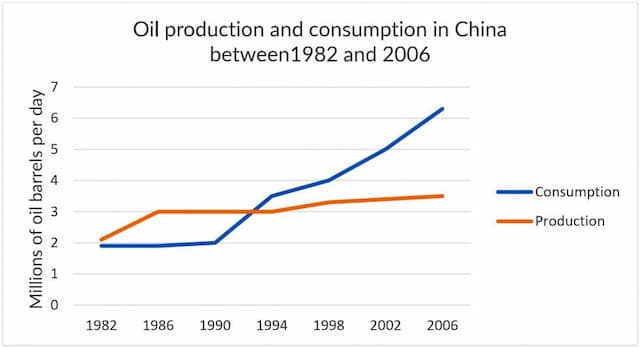
The line chart depicts information about how much oil was produced and consumed in China from 1982 to 2006.

My name is Amandeep Singh and I am writing this letter to bring to your notice that I have left some of my important documents in your hotel's room.
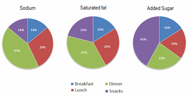
The pie charts illustrate the comparison between sodium, saturated fat, and added sugar in four types of meals (breakfast, lunch, dinner, and snacks) in the USA.

Due to the development of technologies in modern society, more and more people opt for using mobile phones and it invokes debates on whether mobile phone conversations should be prohibited in public places. In this essay, I will explain both views and illustrate my opinion.
Many people believe that acceptance of a bad condition including the lack of money is better than trying to get out of it. Even though the satisfactory feeling of what we already got is good for our mental health, I personally think that striving to upgrade our condition is way much more important to escalate our quality of life.
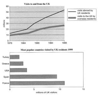
The charts represent information about travel to and from the UK, and about the most popular countries for UK residents to visit. On the first chart, the vertical axe shows the number of visitors to and from the UK. In addition, the horizontal axe depicts the years. It is being seen how the number of visitors to and from the UK fluctuated from 1979 to 1999.

Some people believe that adolescents today are allowed to do anything they want of their own volition. In this essay, however, I will challenge this school of thought.
The majority of the population nowadays, work from the comfort of their home using the available technology. In this essay, I will talk about the upsides and downsides of this changed attitude toward working from their own house and will support my statements using relevant reasons and examples.
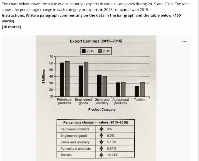
The bar chart provided illustrates the export earnings of a country in five categories, while the table outlines the percentage change between 2015 and 2016.

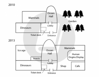
The two maps compared a natural history museum before and after some adjustments to the layout between 2010 and 2013.

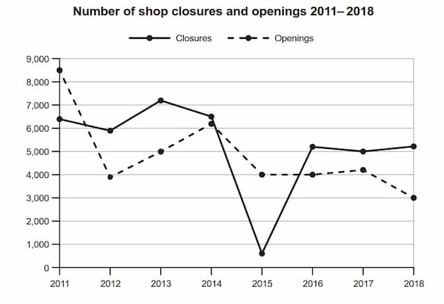
the line graphs compare the number of shops which open and closed between 2010 to 2017.

8
band
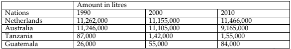
the table illustrates the production of milk per year in 4 particular nations in the years 1990, 2000 and 2010.

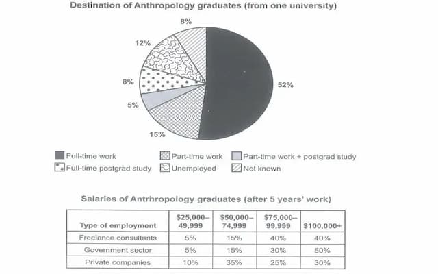
The pie chart provided illustrates the destination of Anthropology graduates from a university while the table depicts the salaries of anthropologists after working for five years.

In modern society, the importance of cash is getting bigger and more since capitalism is the basic rule of recent society. In this regard, there are various views on whether payment is the most precious present for teenagers or not. In this essay, I will illustrate both opinions and explain why cash is the best as gifts.
It is common today that with the advancements in technology, governments tend to monitor people’s daily behaviour by different methods such as security cameras. However, most individuals are unaware of the fact that they are being monitored. In fact, most of them get stressed by the idea that they are being watched since they prefer to keep their life private.
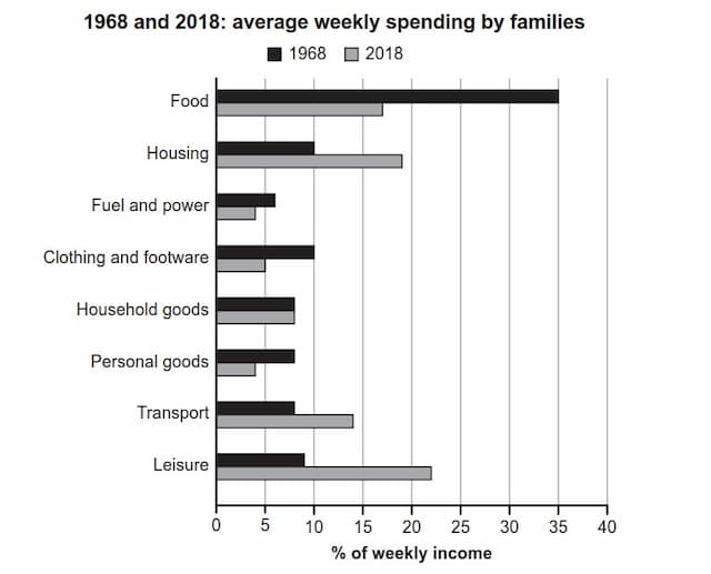
The graph illustrates the average weekly speeding by families in a particular country during the period of time from 1968 to 2018.

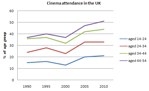
the line chart below compares the percentage of people from four different age groups in a particular country from 1990 to 2010.

How are you? I hope you're doing well. I'm glad to inform you that I'd be organizing an educational event for the underprivileged people in our nearby village. Since my childhood, I wanted to spread education awareness among the villagers and now getting big support from the local council.
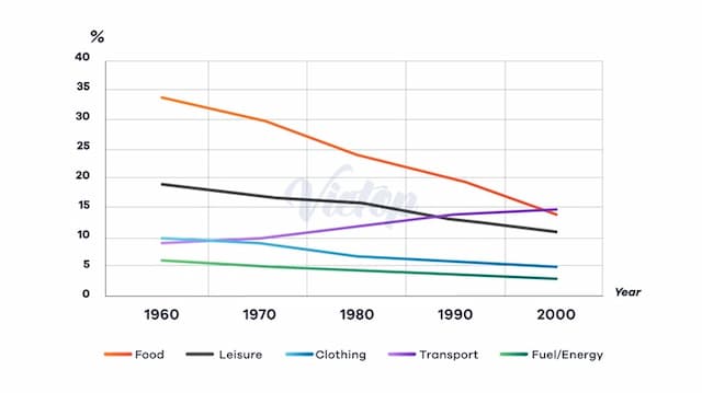
The line graph illustrates how the population of a European country spent their money on food, leisure, clothing, transport, and energy from 1960 to 2000.