The chart and graph below give information about sales and share prices for Coca-Cola. Write a report for a university lecturer describing the information shown below.

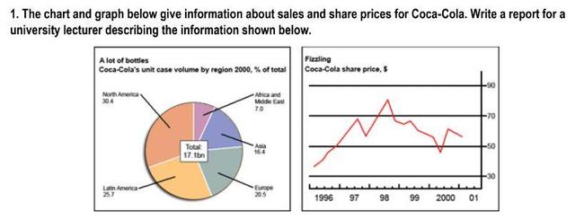
The pie chart and graph illustrated the
percent
of sales and share prices for Coca-Cola respectively in 2000 and the years between 1996 and 2001.
As the pie chart depicted North America was the largest consumer of Coca-Cola pops with a percentage of 30.4% Change the spelling
per cent
while
Africa and the Middle East altogether used only 7%. The second largest community showing interest in drinking this
soda was Latin America which constituted one-fourth of all usage. Finally
, Europe and Asia respectively with about 20% and 16% were other societies of Cola drinkers.
On the other hand
, the graph demonstrated an erratic fluctuation in share price during a 5-year period from 96 to 2001 that leads to a lower price of the drink. It can be seen there is an upward trend between 96 and 98 which has increased the price from just above 30 $ to nearly 80$. Whereas
we can see a steady decline in the next two years to just lower than 50$, in 2001 it slightly rose to about 52$.Submitted by nooshinhabibinejad on
Unauthorized use and/or duplication of this material without express and written permission from this site’s author and/or owner is strictly prohibited. Excerpts and links may be used, provided that full and clear credit is given to Writing9 with appropriate and specific direction to the original content.
Vocabulary: Rephrase your introduction. Words match: 67%.
▼
Vocabulary: The word "chart" was used 2 times.
▼
Vocabulary: The word "graph" was used 2 times.
▼
Vocabulary: The word "about" was used 2 times.
▼