The bar chart compares the proportion of 4 divers transportations usage throughout the commuting to work in one of European city in 3 separate years 1960, 1980 and 2000. The unit is measured in the percentage.

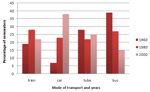
The bar charts illustrate information about different modes of travelling for work
in particular
European countries by four-wheeler,bus, two-wheeler and by walking in the 20-year gap in every period namely 1960,1980 and 2000.
Overall
, it can be seen that commuting by motorcar is an upward trend in the time 2000. On the contrary
, travelling by bike and motorcar had the least usage of a tiny percentage of 5 % in the same year.
Further
analysis of data the commuter usage for travelling by car and bus in 1960 near the quarter 23% and 25 % respectively. Also
after 20 years, the travellers are using bike and foot almost the same per cent 15% and 20%.
Focusing on other data in the year 1960 travellers travel on a walk and it saws the highest proportion compared to all three years. In addition
, bike and foot usage by commuters in limited portions around 15 % and 20 % respectively.Submitted by shitalbuha24 on
Unauthorized use and/or duplication of this material without express and written permission from this site’s author and/or owner is strictly prohibited. Excerpts and links may be used, provided that full and clear credit is given to Writing9 with appropriate and specific direction to the original content.
Vocabulary: The word "data" was used 2 times.
▼