The bar chart compares the proportion of 4 divers transportations usage throughout the commuting to work in one of European city in 3 separate years 1960, 1980 and 2000. The unit is measured in the percentage.

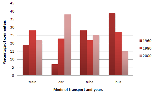
The chart provides data on the percentage of the use of different types of transport in one European city in 1960, 1980 and 2000.
It is clear that
the proportion of car users increased significantly from 5 per cent
in the first year
to more than one-third in 2000.The number of people, who prefer to walk to work plummeted roughly from approximately 33 per cent
in the year
1960 to less than one-tenth of the total in the last
year
. It is obvious that the percentage of bike travellers also
decreased during the given period.
Probing further
, there was a fluctuation in the number of used bikes. The figure grew marginally from about 17 per cent
to more than one-fourth of the total in 1980 and then
upsurged by almost 10 per cent
in the last
year
.
Overall
, the proportion of citizens who prefer cars surged, while
the number of pedestrians fell down.Submitted by mgshetler on
Unauthorized use and/or duplication of this material without express and written permission from this site’s author and/or owner is strictly prohibited. Excerpts and links may be used, provided that full and clear credit is given to Writing9 with appropriate and specific direction to the original content.
Sentences: Add more complex sentences.
▼
Linking words: Don't use the same linking words: "last".
▼
Vocabulary: Replace the words cent, year with synonyms.
▼
Vocabulary: The word "number of" was used 3 times.
▼
Vocabulary: The word "percentage" was used 2 times.
▼
Vocabulary: The word "proportion" was used 2 times.
▼