The graph below compares changes in the birth rates of China and the USA between 1920 and 2000

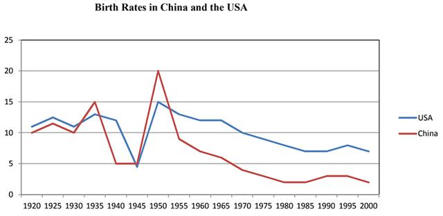
The provided line graph illustrates the information on the
birth
rates
of two different countries, China
and the USA
from 1920 to 2000. Overall
, throughout 80 years, as we can see, the birth
rates
in the two nations both decreased and the lines tended to fluctuate mostly between 1930 and 1955.
To begin
with, it is obvious that at first,
the birth
rates
in the two communities shared the same slight fluctuation in the 1920-1930 period. From 1930 to 1955, the rates
significantly changed, reaching the top in the year 1950. During that time, the birth
rate in China
accounted for 20%, 1.5 times higher than the number in the USA
.
In the 1955-2000 period, it is undeniable that the birth
rates
in USA
and China
shared a downward trend, reaching the bottom at 2% in 1980 and 8% in 1990, respectively. Last
but not least, after 80 years, the birth
rate in the USA
was triple the birth
rate in China
.Submitted by kakaka03 on
Unauthorized use and/or duplication of this material without express and written permission from this site’s author and/or owner is strictly prohibited. Excerpts and links may be used, provided that full and clear credit is given to Writing9 with appropriate and specific direction to the original content.
Sentences: Add more complex sentences.
▼
Vocabulary: Replace the words birth, rates, china, usa with synonyms.
▼
