The graph below shows the consumption of fish and some different kinds of meat in a European country between 1979 and 2004

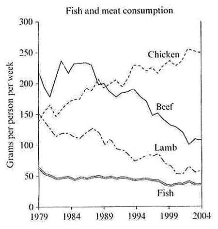
The given line graph depicts information about how much
fish
and three different kinds of meat
were consumed in the period
of 25 years starting from 1979.
Overall
, it is evident that chicken was the leading kind of meat
in its consumption
, whilst beef, lamb, and fish
saw a decrease in the same period
. Additionally
, the lowest consumption
rate was fish
compared with the other figures.
Looking at the rate of beef and lamb in more detail, it is clear from the graph that both these kinds of meat
witnessed a massive decrease from 1979 to 2004. Despite a fluctuating trend in the consumption
of beef in the first period
, it fell dramatically almost 2 times compared to 1979. Meanwhile, lamb meat
witnessed a massive fall to around 60 grams
per person per week in 2004.
In contrast
, consumed chicken meat
rose sharply from approximately 140 grams
in 1979 to 240 grams
per person per week in 2004. On the other hand
, the consumption
of fish
saw a slight decrease over this
period
, merely 15 grams
in 2004.Submitted by itsnotanhtran on
Unauthorized use and/or duplication of this material without express and written permission from this site’s author and/or owner is strictly prohibited. Excerpts and links may be used, provided that full and clear credit is given to Writing9 with appropriate and specific direction to the original content.
Vocabulary: Replace the words fish, meat, period, consumption, grams with synonyms.
▼
Vocabulary: The word "graph" was used 2 times.
▼
Vocabulary: The word "compared" was used 2 times.
▼
Vocabulary: The word "decrease" was used 3 times.
▼
Vocabulary: The word "fell" was used 2 times.
▼