The pie chart and the table chart provides information of the total value and sources of fish imported in the US between 1988 and 2000

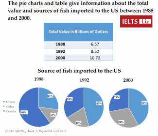
The table shows the money spent in the United States of America on importing fish,
while
the pie chart illustrates from which countries
the highest imports were made in 1988, 1992 and 2000.
In the ,beginning the US imported predominantly from Canada which was the highest i.e., 60% in 1988 and gradually reduced to almost less than half standing at 28% in 2000. Likewise
, China and other countries
improved their exports to the US. Imports from China rose to 30% in 2000, while
other countries
stood at 28% in 2000.
The table provides that the spending had increased over a period from 6.57 billion dollars in 1988, 8.52 billion dollars in 1992 and 10.75 billion dollars in 2000 which was the highest.
Overall
, highest
money was spent in 2000 and other Correct article usage
the highest
countries
exporting the Highest fish to the United States of America.Submitted by reddy_sowmya8110 on
Unauthorized use and/or duplication of this material without express and written permission from this site’s author and/or owner is strictly prohibited. Excerpts and links may be used, provided that full and clear credit is given to Writing9 with appropriate and specific direction to the original content.
Linking words: Don't use the same linking words: "while".
▼
Common mistake: Your writing should be 150-250 words.
Vocabulary: Replace the words countries with synonyms.
▼
Vocabulary: The word "table" was used 2 times.
▼
Vocabulary: The word "stand" was used 2 times.
▼
Vocabulary: Use several vocabularies to present the data in the fourth paragraph.
▼