The graph below shows radio and television audiences throughout the day in 1992. Summarise the information by selecting and reporting the main features, and make comparisons where relevant.

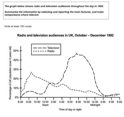
The graph indicates the proportion of the UK population tuning into two different types of entertainment throughout the day in 1992.
Overall
, more people are interested in watching TV rather than listening to the radio.
First of all, TV audiences reached their peak at 8 PM with half of the UK's population. After 8 PM, the number started to consistently decrease until almost 0% at 2 in the morning. However
, as the sun start to rise, the number experienced growth to roughly 8% at 8 AM.
Secondly
, back in the day, TV was not a portable amusement that we can carry everywhere. Therefore
, radio became the best option to tune in while
on the go. The data tells that there was a steady increase in listeners from 6 to 9 AM. The number of the highest summits was nearly 30% at 9 AM. On the contrary
, the percentage keeps declining to just about 1% at 2 AM.Submitted by alifahrc on
Unauthorized use and/or duplication of this material without express and written permission from this site’s author and/or owner is strictly prohibited. Excerpts and links may be used, provided that full and clear credit is given to Writing9 with appropriate and specific direction to the original content.
Sentences: Add more complex sentences.
▼