The line graph show of amount of carbon dioxide emissions in 1976 to 2007 in four countries united Kingdom, Sweden Italy and Portugal.

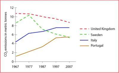
The graph illustrates different amounts of CO2 emitted between 1967 and 2007 in 4 different European countries.
Overall
, it can be seen that England produced by far the highest CO2 amounts.
In the first 10 years,UK and Sweeden emitted a lot of CO2 into the air with a quantity reaching nearly 10 metric tonnes in 1977 for both nations. However
, Sweden's emissions dropped significantly since then
by almost one-half in 2007. Meanwhile, the UK continued to make CO2 with a very slight drop at the end
of the shown period.
Italy and Portugal's trends were similar in the shown period with a steady increase. Despite this
, Portugal had the lowest emissions throughout that time until 2007 when the figures approached 5 metric tonnes which is slightly more than the Swedish production. Meanwhile, Italy's emissions were increasing dramatically reaching 8 metric tonnes which made this
country the second-highest CO2 producer in 2007.Submitted by mysobalamy on
Unauthorized use and/or duplication of this material without express and written permission from this site’s author and/or owner is strictly prohibited. Excerpts and links may be used, provided that full and clear credit is given to Writing9 with appropriate and specific direction to the original content.
Vocabulary: Replace the words co with synonyms.
▼
Vocabulary: The word "amounts" was used 2 times.
▼
Vocabulary: The word "slight" was used 2 times.
▼