thr table and the charts below give information the police budget for 2017 and 2018 in a one area of britian. the table shows where the money vame from and the chart shows how it was distributed

The given table denotes the police budget for a certain area of Britain for 2017 and 2018. The following pie charts display how the respective expenditures are shared among three categories.
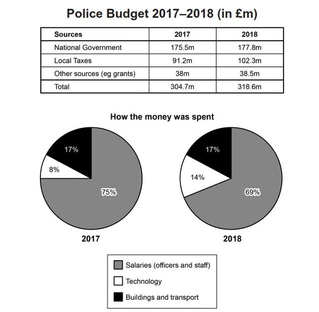
Overall
, the income from each source has increased in the adjacent years. The highest funding is received from the government. A staggering amount of 175.5 million Pounds were granted in 2017. Subsequently
, it is raised to 177.8 million Pounds in 2018. However
, the highest growth of cash inflow is recorded from the local taxes. Approximately, more than 10 million Pounds were secured in 2018.
On the other hand
, the biggest share of spending is incurred due to
the payment of salaries. Nevertheless
, the cash outflow on wages has been deducted from 75% to 69 % in the consecutive years. With regard to the pie charts, the least expensive cost is the cost of technology. Despite its low spending, the price tag of technology has grown by 6 % in 2018.Submitted by wmpabasara2 on
Unauthorized use and/or duplication of this material without express and written permission from this site’s author and/or owner is strictly prohibited. Excerpts and links may be used, provided that full and clear credit is given to Writing9 with appropriate and specific direction to the original content.
Vocabulary: Rephrase the word "give" in your introduction.
▼
Vocabulary: The word "charts" was used 2 times.
▼