The pie chart shows the percentage of persons arrested in the five years ending 1994 and the bar chart shows the most recent reasons for arrest.

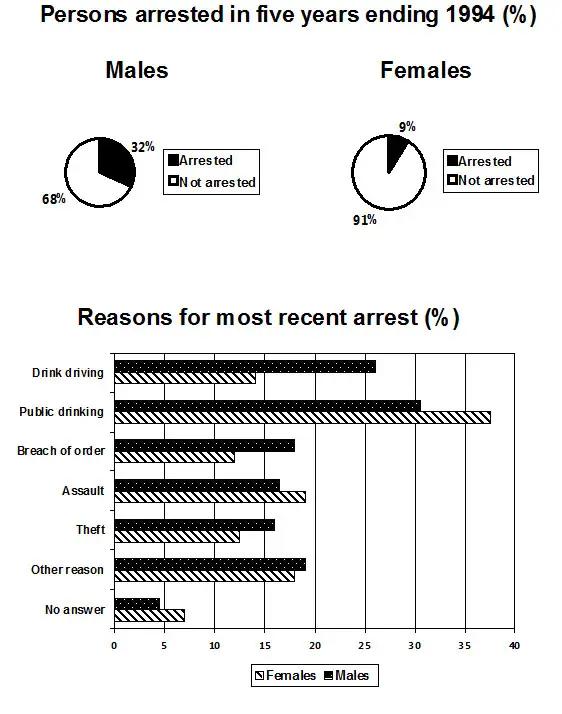
The pie charts display the proportions of females and males arrested from 1989 to 1984.
Whereas
, the bar chart gives information about the reasons for which males and females were arrested.
Overall
, it can be seen that the number of males that were arrested is higher than the females'.
Regarding men, 32% of them were arrested, of which most of the arrests, around 30 per cent of them happened for public drinking. This
cause is just followed by those caught driving after drinking, accounting for approximately twice the percentage of women caught doing it. Meanwhile, the least popular offence among men was theft, as it accounted for just above 15 per cent.
On the other hand
, just 9% of women committed crimes that led to an arrest. Just like men, their most committed offence was public drinking, outnumbering them by a little more than 5%. Noteworthy, the arrests due to
a breach of order and theft were the least executed, both at roughly 13 per cent.Submitted by marianiculescu1103 on
Unauthorized use and/or duplication of this material without express and written permission from this site’s author and/or owner is strictly prohibited. Excerpts and links may be used, provided that full and clear credit is given to Writing9 with appropriate and specific direction to the original content.
Vocabulary: The word "charts" was used 2 times.
▼