The chart below shows the value of one country's exports in various categories

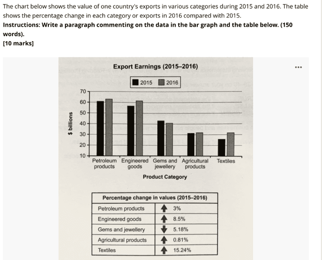
The Bar Graph represents the export revenue of a country in numerous categories in 2015 and 2016.
likewise
,the table informs the difference in percentages of each classification of export from 2015 to 2016.
Overall
, it can be seen that most of the income comes from petroleum and engineered goods.furthermore
, only the textile industry got a moderate change in values and Jewellery and gem categories were the only ones to face a downward trend.
Firstly
, in 2015, petroleum items made roughly around 60 billion
dollars. with a 3% change in 2016, the figure almost touched the 65 Billion
mark.moreover
, the difference between both years of engineered items is a whopping 8.5%, from a little above 55 billion
to 60+ billion
.
on the other hand
, agricultural goods had little to no change. in both years, they made around 30 billion
and on the darker side, the sales of jewels and jewellery crashed by 5.18 per cent. from 43 billion
to approx 40 billion
. meanwhile, the textile industry shot up in 2016 with an increase of 15.24% of 28 billion
earned in 2015.Submitted by anishakumarileemani on
Unauthorized use and/or duplication of this material without express and written permission from this site’s author and/or owner is strictly prohibited. Excerpts and links may be used, provided that full and clear credit is given to Writing9 with appropriate and specific direction to the original content.
Vocabulary: Replace the words billion with synonyms.
▼
Vocabulary: The word "change" was used 3 times.
▼
Vocabulary: The word "difference" was used 2 times.
▼
Vocabulary: The word "around" was used 2 times.
▼