Bar graph below shows the amount of carbon emissions in different countries during three different years.

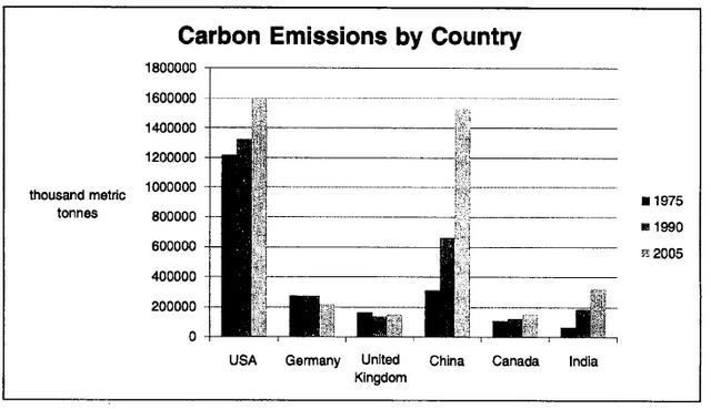
A glance at the bar chart provided reveals the total amount of producing carbon in terms of six countries in 1975,1990 and 2005(units:thousand metric tonnes).
Overall
, it is clear to see that Germany and UK had reduced their carbon emissions, whereas
the USA,China,Canada and India produced more and more over this
period. Furthermore
, the whole weight released by the USA was heaviest than the other five countries every year.
In 1975, the number of America was by far the highest, at above 120000 thousand metric tonnes. Then
it reached a climax of 160000 in 2005, almost rising by 400,0000. Another considerable growth also
can be seen in China, it accounted for approximately 60000 thousand metric tonnes in the first year of 1975, after went up dramatically, peaking at 150000 in 2005(three times as much as the original data.) By contrast
, India was at the lowest place of releasing carbon emissions, only about 30000.
However
, Germany kept a stable trend in 1975 and 1990, sharing the same volume of 210000, after that point, it fell by 10000 in 2005. The UK showed a slight decrease compared to Canada(with the opposite development). But both of them changed not obviously, with the number under 200000 and xxxxx respectively.Submitted by zjlslqls on
Unauthorized use and/or duplication of this material without express and written permission from this site’s author and/or owner is strictly prohibited. Excerpts and links may be used, provided that full and clear credit is given to Writing9 with appropriate and specific direction to the original content.
Vocabulary: Rephrase the word "amount" in your introduction.
▼