The graph below shows the proportion of four different materials that were recycled from 1982 to 2010 in a particular country. Sumarise the information by selecting and reporting the main eatures, and make comparisons where relevant.

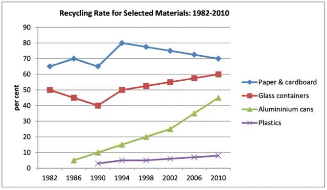
The chart provides data on, how reused four different types of items were in a country from 1982 to 2010.
Overall
, there was a fluctuation in converting used materials into their original state. Reprocess of aluminium cans showed an upward trend over the time period but the recycling rate of paper and cardboard always stayed at the highest point. In this
country reused proportions of plastics were less than in all other categories, whereas
it increased slightly.
According to
the graph, paper and cardboard reached a peak from 1990 to 1994 and 70% was the highest rate of this
process in contrast
with other items. During the year limit approximately 50% of aluminium cans were renewed.Although
the starting rate for this
criterion and plastics stood at less than 10% at the end
of the time period, there was negligible growth in plastics. Glass containers decreased marginally to 40% by the year 1990, then
that rose sharply up to 60%. Furthermore
, in that figure percentage for 1952 and 1994 remained at 50%.Submitted by hoshisajana1997 on
Unauthorized use and/or duplication of this material without express and written permission from this site’s author and/or owner is strictly prohibited. Excerpts and links may be used, provided that full and clear credit is given to Writing9 with appropriate and specific direction to the original content.