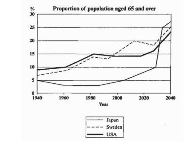
The graph below shows the proportion of the population aged 65 and over between 1940 and 2040 in three different countries.

This
line chart depicts people 65 years old and above compared with the whole population in three different countries: the United States, Sweden, and Japan from 1940 to 2040. A glance at the graphs provided reveals the ratio increased throughout the period.
According to
what is shown, USA and Sweden illustrated similar patterns. Both countries increased steadily from 7.5 and 9 per cent nearly 7 per cent respectively in the first 4 decades. After a small dip in the figures of the US and Sweden, USA's ratio sustained at about the same level while
the other increased from 13% to 18% reaching its peak at 20% by the end of 2020.
Japan, on other hand, decreased gradually till it levelled at 3% from 1940 to 1999. A gradual increment of 2% took place till 2007. The ratio will rocket significantly to its peak at 28 per cent after a steady increase beforehand.
To sum up
, we could say that Japan has a much lower population aged 65 and over compared with the other two countries except in the last
decade.Submitted by Lamaalkhelaiwi on
Unauthorized use and/or duplication of this material without express and written permission from this site’s author and/or owner is strictly prohibited. Excerpts and links may be used, provided that full and clear credit is given to Writing9 with appropriate and specific direction to the original content.
Vocabulary: The word "compared" was used 2 times.
▼
Vocabulary: The word "ratio" was used 3 times.
▼
Vocabulary: The word "increased" was used 4 times.
▼
Vocabulary: The word "gradually" was used 2 times.
▼