IELTS Writing Samples Band 7
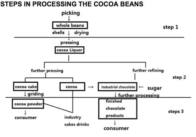
The diagram illustrates the steps required for processing cocoa beans.

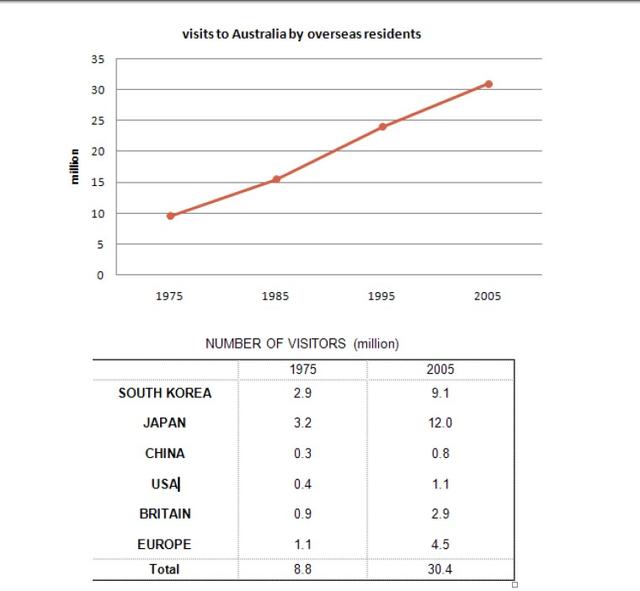
The given charts illustrate two different pieces of data. The upper one is about the number of overseas visitors in Australia from 1975 to 2005; the other shows the nationality of visitors in Australia in 1975 and 2005.

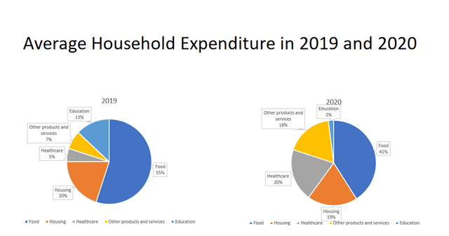
The given charts depict the comparison between household expenses in 2019 and 2020 in some sectors which are food, housing, healthcare, education and other products and services. In general, the food sector consumed the biggest percentage of expenses compared to other types of expenditure.

These days, there is a controversy about whether people need inborn talent to succeed in art or sports fields. Some people believe that even though children do not have it, they can be educated as successful people. However, others firmly believe that it is a must condition to be successful in those fields, which is the same view as me.
Nowadays, it is very popular to have cosmetic surgeries that change specific features in our body. There is no doubt that the number of these medical surgeries keeps increasing significantly. There are many reasons that make people have these surgeries, but I believe that these operations are very dangerous and can affect you negatively.
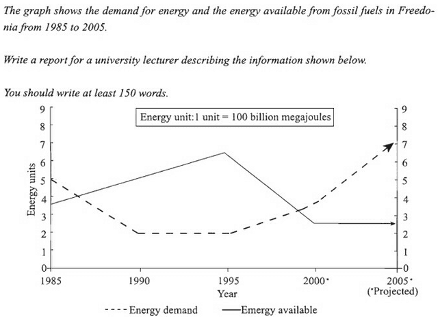
The graph gives information about the demand for energy and the energy available for fossil fuels in Freedonia between 1985 and 2005.

There is a saying that professionals, for ,example doctors and engineers, are supposed to be forced to work in the country where they got their professional skills and knowledge. In my opinion, although it is understandable experts should work for the country where they were educated and trained, they ought to have the right to choose any other country in which they hope to work.
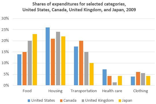
The bar chart describes spending in five lifestyle categories for residents of four different nations in 2009. Looking from an overall perspective, it is readily apparent that housing, food, and transportation are the biggest expenses in nearly all countries, with those in the United States spending the most on their homes and those in Japan the most on food. Healthcare and clothing are smaller expenses and transportation is a greater expenditure than food in only Canada and the US.

Nowadays, people have various opinions on what they think are the most critical environmental concerns. While some argue that the extinction of specific plants and animals is the most concerning, I believe that the surrounding has many essential crises.
Many people have been associating happiness with high paid jobs, and this could be a controversial statement. On the other hand, others believe that to be happy people need to balance their professional and personal life. I'm not an expert, but I agree that is extremely important for people to balance life satisfaction between the professional and personal areas.
I am writing with pleasure to share my experience at your restaurant located at Anne Steet, Toronto. I was there with some friends on Sunday evening for dinner, and I was extremely delighted by the service I received.
the two Pies chart gives information about the proportion of household expenditure in six Major categories, hence, from 1950 and 2010 in one country.

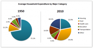
The pie chart depicts the proportion by the percentage of the average household expenditure of 6 main categories between 1950 and 2010,

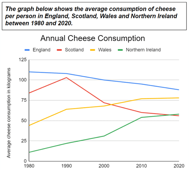
The Line graph gives information about the medium amount consumption of cheese per kilogram for every person living in England, Scotland, Wales and Northern Ireland in the five years 1980, 1990, 2000, 2010 and 2020.

These days, the global population is growing at a significant rate. While there are comments that this development will lead to a crisis over the world, it is an opinion that it contributes to the growth of the world’s economy and society. This essay will discuss both viewpoints and draw my conclusion.
people these days think that technological device has affected the way that community communicate positively and others believe it has had a negative impact on communication with others. This essay will discuss both views on the topic.
In this day and age, many people tend to work for themselves instead of working for a company. In this essay, I will outline some possible reasons for this, as well as its potential drawbacks.
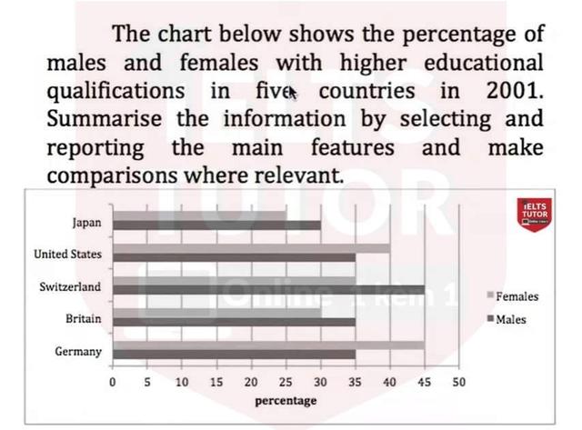
the bar chart compares the proportion of males and females having higher education qualifications in 5 particular nations in the year 2001.

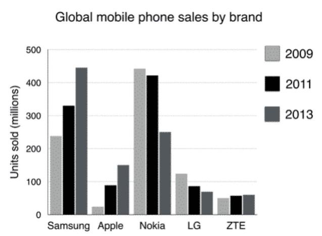
The bar chart compares the number of mobile phones sold worldwide by the five most popular manufacturers in the years 2009, 2011 and 2013.!

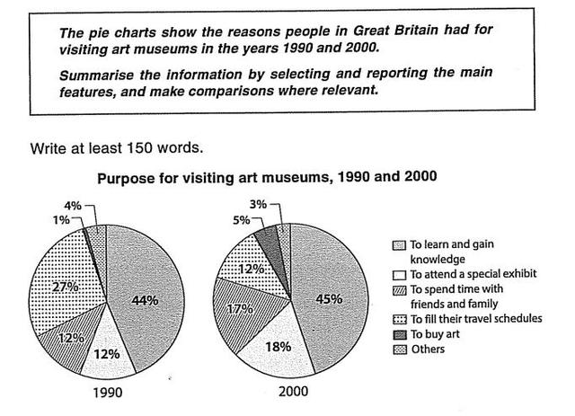
The two pie charts display the reasons why tourists from England visited art museums in 1990 and 2000.